---
title: Understanding SHAP one path at a time
description: Build a SHAP explanation from the predictions produced while transforming a background observation into the observation we want to explain.
author: Joshua Kunst
date: 2026-08-14
categories: [R, machine-learning, explainability]
toc: true
toc-location: left
image: images/shap-waterfall-preview.png
---
```{r}
#| label: setup
#| include: false
source(here::here("blog", "_R", "post_setup.R"))
install_missing_packages(c(
"dplyr",
"ggbeeswarm",
"ggplot2",
"highcharter",
"knitr",
"modeldata",
"scales",
"tibble",
"tidyr",
"xgboost"
))
```
SHAP is usually introduced through Shapley values, coalitions and game theory. All of that matters, but I find it easier to first look at the actual rows that a model sees.
The idea in this post is simple: start from one background observation, transform it into the observation we want to explain **one variable at a time**, and watch how the model prediction changes along the way.
## A model and a prediction
Assume we already have a credit-risk model, a training sample, a test sample and a vector with the predictor names. The details of the model are not important for what follows, so the preparation code is folded below.
```{r}
#| label: prepare-credit-model
#| code-fold: true
#| code-summary: "Show model preparation"
#| message: false
library(dplyr)
library(ggbeeswarm)
library(ggplot2)
library(modeldata)
library(tibble)
library(tidyr)
library(xgboost)
predictors <- c(
"seniority", "time", "age", "expenses", "income",
"assets", "debt", "amount", "price"
)
credit_data <- modeldata::credit_data |>
tibble::as_tibble() |>
dplyr::rename_with(tolower) |>
tidyr::drop_na(status, dplyr::all_of(predictors)) |>
dplyr::mutate(status_bad = as.integer(status == "bad")) |>
dplyr::select(status_bad, dplyr::all_of(predictors))
set.seed(2026)
train_id <- sample.int(nrow(credit_data), floor(0.75 * nrow(credit_data)))
train <- credit_data[train_id, ]
test <- credit_data[-train_id, ]
dtrain <- xgboost::xgb.DMatrix(
as.matrix(train[, predictors]),
label = train$status_bad
)
set.seed(2026)
model <- xgboost::xgb.train(
data = dtrain,
nrounds = 150,
params = list(
objective = "binary:logistic",
eval_metric = "logloss",
max_depth = 4,
eta = 0.05
),
verbose = 0
)
predict_model <- function(model, newdata) {
stats::predict(
model,
xgboost::xgb.DMatrix(as.matrix(newdata[, predictors]))
)
}
```
Let's take one observation from the test sample. This is the prediction we want to explain.
```{r}
#| label: select-observation-to-explain
x <- test |>
dplyr::slice(1) |>
dplyr::select(dplyr::all_of(predictors))
prediction_x <- predict_model(model, x)
```
Before doing anything else, let's look at the actual values of the observation.
```{r}
#| label: show-observation-to-explain
#| column: page
x |>
dplyr::mutate(prediction = prediction_x) |>
knitr::kable(digits = 4)
```
The model gives this observation a probability of `r sprintf("%.1f%%", 100 * prediction_x)`.
Our question is simply: **where does this prediction come from?**
## Start from a background observation
SHAP needs a reference. Let's take a small sample from the training data as our background and, for the moment, choose only one observation from it.
```{r}
#| label: sample-background
set.seed(2026)
background <- train |>
dplyr::slice_sample(n = 50) |>
dplyr::select(dplyr::all_of(predictors))
z <- background |>
dplyr::slice(1)
prediction_z <- predict_model(model, z)
```
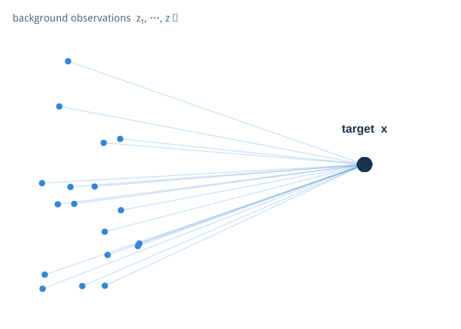
One background row is useful for understanding a single path, but it is not a
privileged reference. The eventual explanation uses many background
observations, each offering a different route toward the same target `x`.
```{r}
#| label: illustrate-background-paths
#| column: page
set.seed(2026)
background_diagram <- tibble::tibble(
x = runif(18, 0.05, 0.32),
y = runif(18, 0.08, 0.92),
xend = 0.82,
yend = 0.50
)
ggplot(background_diagram) +
geom_segment(
aes(x, y, xend = xend, yend = yend),
color = scales::alpha("#3487d4", 0.23),
linewidth = 0.55,
arrow = grid::arrow(length = grid::unit(0.09, "inches"))
) +
geom_point(aes(x, y), color = "#3487d4", size = 2.6) +
geom_point(aes(xend, yend), color = "#17324d", size = 7) +
annotate(
"text", x = 0.18, y = 0.99,
label = "background observations z₁, …, zₙ",
color = "#52677b", size = 4
) +
annotate(
"text", x = 0.82, y = 0.62,
label = "target x",
color = "#17324d", fontface = "bold", size = 4.5
) +
coord_cartesian(xlim = c(0, 1), ylim = c(0, 1), clip = "off") +
theme_void()
```
This is only a conceptual diagram—the real paths live in predictor space—but
it captures the role of the background sample: many plausible starting points
are transformed toward the same observation we want to explain.
Now we can put the observation we want to explain, `x`, next to the background observation, `z`.
```{r}
#| label: compare-target-and-background
#| column: page
comparison <- dplyr::bind_rows(
target = x,
background = z,
.id = "observation"
)
comparison$prediction <- predict_model(model, comparison)
comparison |>
knitr::kable(digits = 4)
```
We have two rows, two sets of values and two model predictions. Instead of jumping directly from `z` to `x`, let's move from one to the other one variable at a time.
## One path from z to x
First choose a random order for the predictors.
```{r}
#| label: choose-first-variable-order
set.seed(1)
order_1 <- sample(predictors)
order_1
```
Now start from `z`. Replace the first variable with its value in `x`, then the second one, then the third one, and continue until every value comes from `x`.
```{r}
#| label: define-path-builder
build_path <- function(x, z, variable_order) {
current <- z
states <- list(current)
for (variable in variable_order) {
current[[variable]] <- x[[variable]]
states[[length(states) + 1L]] <- current
}
dplyr::bind_rows(states) |>
dplyr::mutate(
step = 0:length(variable_order),
changed = c("background", variable_order),
.before = 1
)
}
```
With nine predictors we get ten rows: the original background observation, one row for each variable replacement, and finally `x` itself.
```{r}
#| label: build-first-path
path_1 <- build_path(x, z, order_1)
path_1$prediction <- predict_model(model, path_1)
```
If we display the columns in the same order in which they were introduced, the construction has a staircase-like shape. At each row, one more value has moved from `z` to `x`.
```{r}
#| label: show-first-path
#| column: page
path_1 |>
dplyr::select(step, changed, dplyr::all_of(order_1), prediction) |>
knitr::kable(digits = 4)
```
The model does not know anything about SHAP here. It simply predicts ten observations.
Because only one variable changes between consecutive rows, the difference between two consecutive predictions can be assigned to the variable that just changed.
```{r}
#| label: calculate-first-path-contributions
contributions_1 <- path_1 |>
dplyr::transmute(
variable = changed,
prediction,
contribution = prediction - dplyr::lag(prediction)
) |>
dplyr::filter(variable != "background")
contributions_1 |>
knitr::kable(digits = 4)
```
For this path, if replacing `debt` changes the prediction from 0.10 to 0.16, then the contribution of `debt` along this path is simply `+0.06`.
Nothing more sophisticated has happened yet: we are just taking differences between consecutive predictions.
## Same observations, different path
There is an immediate problem: the contribution of a variable can depend on what was changed before it.
Let's keep **exactly the same `x` and the same `z`** and change only the order of the variables.
```{r}
#| label: choose-second-variable-order
set.seed(2)
order_2 <- sample(predictors)
order_2
```
Build and predict the second path.
```{r}
#| label: build-second-path
path_2 <- build_path(x, z, order_2)
path_2$prediction <- predict_model(model, path_2)
```
Again, the first row is exactly `z` and the last row is exactly `x`, but the observations in between are different.
```{r}
#| label: show-second-path
#| column: page
path_2 |>
dplyr::select(step, changed, dplyr::all_of(order_2), prediction) |>
knitr::kable(digits = 4)
```
And therefore the intermediate changes can also be different.
```{r}
#| label: compare-path-contributions
contributions_2 <- path_2 |>
dplyr::transmute(
variable = changed,
prediction,
contribution = prediction - dplyr::lag(prediction)
) |>
dplyr::filter(variable != "background")
path_comparison <- dplyr::bind_rows(
path_1 = contributions_1,
path_2 = contributions_2,
.id = "path"
) |>
dplyr::select(path, variable, contribution) |>
tidyr::pivot_wider(
names_from = path,
values_from = contribution
) |>
dplyr::mutate(difference = path_2 - path_1)
path_comparison |>
knitr::kable(digits = 4)
```
Both paths start at the same prediction, `p(z)`, and finish at the same prediction, `p(x)`. What changes is how the total difference is distributed among the variables.
This is the first key idea behind SHAP:
> There is no single privileged order in which the variables should enter the prediction.
For nonlinear models and models with interactions, the context in which a variable is introduced matters.
## From one path to many paths
Trying every possible order quickly becomes impossible. With nine variables there are already `9! = 362,880` possible orders.
Instead, we can sample paths.
There is another arbitrary choice in our example: the background observation itself. Why should one particular `z` define our reference?
So we repeat the same experiment over many observations from the background. For each background observation we draw a random variable order, build the path to `x`, predict every row and keep the consecutive differences.
```{r}
#| label: define-path-contribution-helper
one_path <- function(model, x, z, variable_order) {
path <- build_path(x, z, variable_order)
path$prediction <- predict_model(model, path)
path |>
dplyr::transmute(
variable = changed,
contribution = prediction - dplyr::lag(prediction)
) |>
dplyr::filter(variable != "background")
}
```
```{r}
#| label: sample-background-paths
set.seed(2026)
trace <- dplyr::bind_rows(lapply(seq_len(nrow(background)), function(i) {
variable_order <- sample(predictors)
one_path(
model = model,
x = x,
z = background[i, ],
variable_order = variable_order
) |>
dplyr::mutate(background_id = i, .before = 1)
}))
glimpse(trace)
```
Now every variable has many observed contributions, obtained under different starting points and different contexts.
The SHAP approximation is simply their average.
```{r}
#| label: summarize-shap-values
shap_values <- trace |>
dplyr::summarise(
shap = mean(contribution),
.by = variable
) |>
dplyr::arrange(desc(abs(shap)))
shap_values |>
knitr::kable(digits = 4)
```
This is a Monte Carlo approximation of marginal SHAP: instead of enumerating every possible permutation, we sample paths and average the contribution assigned to each variable.
## Adding the contributions
There is a useful property hiding in plain sight.
The official SHAP introduction shows the same idea with a waterfall: begin at
the expected model output and add the feature contributions until reaching the
prediction for one observation.[^shap-guide] Our path construction lets
us see where those additions come from. For an R-focused explanation, the
*Explanatory Model Analysis* guide shows how `DALEX::predict_parts()` decomposes
one prediction into contributions from individual variables.[^dalex-guide]
[^shap-guide]: See the official SHAP guide, [*An introduction to explainable AI with Shapley values*](https://shap.readthedocs.io/en/stable/example_notebooks/overviews/An%20introduction%20to%20explainable%20AI%20with%20Shapley%20values.html).
[^dalex-guide]: See [*Break-down Plots for Additive Attributions*](https://ema.drwhy.ai/breakDown.html) in *Explanatory Model Analysis*.
For any single path, the contributions are consecutive differences:
$$
[p(s_1)-p(s_0)] + [p(s_2)-p(s_1)] + \cdots + [p(x)-p(s_{p-1})].
$$
Everything in the middle cancels, leaving
$$
p(x) - p(z).
$$
Averaging over the background observations gives
$$
p(x) = E[p(z)] + \sum_j \phi_j.
$$
We can check that directly.
```{r}
#| label: verify-shap-reconstruction
background_mean <- mean(predict_model(model, background))
reconstructed <- background_mean + sum(shap_values$shap)
reconstruction <- tibble::tibble(
background_mean = background_mean,
shap_sum = sum(shap_values$shap),
reconstructed = reconstructed,
prediction = prediction_x
)
reconstruction |>
knitr::kable(digits = 6)
```
This is why the familiar SHAP waterfall works: start from the background prediction, add the contribution of each variable, and arrive at the prediction for the observation we wanted to explain.
## From SHAP values to a waterfall
Now that we have the pieces, we can draw the same type of waterfall used in the SHAP Explorer app.
The first bar is the mean prediction over the background sample. Each variable then moves the prediction up or down by its SHAP value. Red contributions increase the predicted probability of default, blue contributions decrease it, and the final bar is the prediction for `x`.
The order of the bars here is only a display choice: the SHAP values have already been averaged across the sampled paths.
```{r}
#| code-fold: true
#| label: plot-shap-waterfall
#| column: page
#| message: false
library(highcharter)
profile_labels <- c(
seniority = "Seniority",
time = "Loan term",
age = "Age",
expenses = "Expenses",
income = "Income",
assets = "Assets",
debt = "Debt",
amount = "Loan amount",
price = "Price"
)
contribution_points <- lapply(seq_len(nrow(shap_values)), function(i) {
value <- 100 * shap_values$shap[[i]]
variable <- shap_values$variable[[i]]
list(
name = unname(profile_labels[[variable]]),
y = unname(value),
color = if (value >= 0) "#d95f59" else "#4c91d9"
)
})
waterfall_data <- unname(c(
list(list(
name = "Background<br/>mean",
y = 100 * background_mean,
color = "#e0e0e0"
)),
contribution_points,
list(list(
name = "Predicted<br/>PD",
isSum = TRUE,
color = "#34495e"
))
))
highchart() |>
hc_add_dependency("modules/waterfall.js") |>
hc_chart(type = "waterfall") |>
hc_xAxis(type = "category") |>
hc_yAxis(title = list(text = "Probability of default (%)")) |>
hc_legend(enabled = FALSE) |>
hc_tooltip(pointFormat = "{point.y:.1f}") |>
hc_plotOptions(series = list(
borderWidth = 0,
dataLabels = list(
enabled = TRUE,
inside = FALSE,
useHTML = TRUE,
style = list(
color = "#495057",
fontWeight = "normal",
textOutline = "none"
),
formatter = JS(paste(
"function () {",
" if (this.point.isSum || this.point.index === 0) {",
" const value = Highcharts.numberFormat(this.y, 1) + '%';",
" return '<span style=\"font-size: 13px; font-weight: 600\">' + value + '</span>';",
" }",
" return (this.y >= 0 ? '+' : '') + Highcharts.numberFormat(this.y, 1) + ' pp';",
"}"
))
)
)) |>
hc_add_series(
name = "PD",
data = waterfall_data
)
```
The chart is just another view of the identity we checked above:
$$
\text{background mean} + \sum_j \phi_j = p(x).
$$
```{r}
#| label: prepare-compact-shap-waterfall
#| include: false
compact_shap <- shap_values |>
dplyr::mutate(
group = dplyr::case_when(
variable %in% c("amount", "price", "time") ~ "Loan",
variable %in% c("income", "expenses") ~ "Capacity",
variable %in% c("assets", "debt") ~ "Balance",
TRUE ~ "Profile"
),
group = factor(group, levels = c("Loan", "Capacity", "Balance", "Profile"))
) |>
dplyr::summarise(contribution = sum(shap), .by = group) |>
dplyr::arrange(group) |>
dplyr::mutate(
start = background_mean + dplyr::lag(cumsum(contribution), default = 0),
end = start + contribution,
step = dplyr::row_number() + 1L
)
compact_bars <- dplyr::bind_rows(
tibble::tibble(
label = "Background",
step = 1L,
start = 0,
end = background_mean,
contribution = background_mean,
kind = "total"
),
compact_shap |>
dplyr::transmute(
label = as.character(group), step, start, end, contribution,
kind = if_else(contribution >= 0, "increase", "decrease")
),
tibble::tibble(
label = "Prediction",
step = 6L,
start = 0,
end = prediction_x,
contribution = prediction_x,
kind = "prediction"
)
) |>
dplyr::mutate(
ymin = pmin(start, end),
ymax = pmax(start, end),
label = factor(label, levels = label)
)
```
```{r}
#| label: plot-compact-shap-waterfall
#| include: false
compact_waterfall_plot <- ggplot(compact_bars) +
geom_rect(
aes(
xmin = step - 0.34,
xmax = step + 0.34,
ymin = 100 * ymin,
ymax = 100 * ymax,
fill = kind
),
color = NA
) +
geom_segment(
data = compact_shap[-nrow(compact_shap), ],
aes(
x = step + 0.34,
xend = step + 1 - 0.34,
y = 100 * end,
yend = 100 * end
),
color = "#aeb8c2",
linewidth = 0.45,
linetype = 2,
inherit.aes = FALSE
) +
geom_text(
data = dplyr::filter(compact_bars, kind %in% c("increase", "decrease")),
aes(
x = step,
y = 100 * ymax + 1.2,
label = sprintf("%+.1f pp", 100 * contribution)
),
color = "#52606d",
size = 3.5
) +
scale_x_continuous(
breaks = compact_bars$step,
labels = levels(compact_bars$label)
) +
scale_fill_manual(
values = c(
total = "#d9dde2",
decrease = "#4c91d9",
increase = "#d95f59",
prediction = "#34495e"
),
guide = "none"
) +
labs(
title = "Four groups move the baseline toward one prediction",
x = NULL,
y = "Probability of default (%)"
) +
theme(
axis.text.x = element_text(angle = 35, hjust = 1)
)
ggsave(
filename = "images/shap-waterfall-preview.png",
plot = compact_waterfall_plot,
width = 8,
height = 5,
units = "in",
dpi = 144,
bg = "white"
)
```
## The whole idea
Before moving to the summary, it is worth distinguishing two familiar SHAP
views. The waterfall above is **local**: it explains one prediction. A beeswarm
is **global**: every point represents one observation's contribution for one
variable. Horizontal position shows whether that variable moved the prediction
down or up; color shows whether the original feature value was relatively low
or high. The vertical spreading only prevents overlapping points and reveals
the distribution.
```{r}
#| label: calculate-global-shap-sample
#| message: false
set.seed(2026)
global_targets <- test |>
dplyr::slice_sample(n = 60) |>
dplyr::select(dplyr::all_of(predictors))
global_trace <- dplyr::bind_rows(lapply(seq_len(nrow(global_targets)), function(target_id) {
target_x <- global_targets[target_id, , drop = FALSE]
background_ids <- sample.int(nrow(background), 15, replace = TRUE)
dplyr::bind_rows(lapply(background_ids, function(background_id) {
one_path(
model = model,
x = target_x,
z = background[background_id, , drop = FALSE],
variable_order = sample(predictors)
)
})) |>
dplyr::summarise(
shap = mean(contribution),
.by = variable
) |>
dplyr::mutate(target_id = target_id)
}))
feature_values <- global_targets |>
dplyr::mutate(target_id = dplyr::row_number()) |>
tidyr::pivot_longer(
cols = dplyr::all_of(predictors),
names_to = "variable",
values_to = "feature_value"
)
global_shap <- global_trace |>
dplyr::left_join(feature_values, by = c("target_id", "variable")) |>
dplyr::mutate(
scaled_value = scales::rescale(feature_value, to = c(0, 1)),
.by = variable
) |>
dplyr::mutate(
variable = reorder(variable, abs(shap), FUN = mean)
)
```
```{r}
#| label: plot-global-shap-beeswarm
#| column: page
ggplot(global_shap, aes(shap, variable, color = scaled_value)) +
geom_vline(xintercept = 0, color = "#8a96a3", linewidth = 0.5) +
ggbeeswarm::geom_quasirandom(
groupOnX = FALSE,
width = 0.32,
size = 1.7,
alpha = 0.82
) +
scale_color_gradientn(
colors = c("#1687e8", "#7b3fc6", "#f40064"),
limits = c(0, 1),
breaks = c(0, 1),
labels = c("Low", "High")
) +
labs(
title = "How variables move predictions across observations",
subtitle = "Each point is one approximate local SHAP value",
x = "SHAP value (impact on predicted probability)",
y = NULL,
color = "Feature value"
) +
theme(
panel.grid.major.y = element_line(color = "#e4e9ee", linetype = 3),
legend.position = "right"
)
```
The complete calculation can be summarized without game theory notation:
1. Pick an observation `x` to explain.
2. Pick a background observation `z`.
3. Randomly order the predictors.
4. Transform `z` into `x`, one variable at a time.
5. Predict every intermediate row.
6. Take differences between consecutive predictions.
7. Repeat for more background observations and variable orders.
8. Average the differences by variable.
That average is our SHAP approximation.
I like this construction because the explanation emerges from objects we already know how to inspect: rows, predictions and differences. The formal Shapley framework tells us why averaging across different contexts is the right thing to do, but the staircase of observations shows what the model is actually being asked to evaluate.
The helper `one_path()` exists only to package the repeated
unit of work: build one path, predict its intermediate states and return the
consecutive differences. Keeping that operation named makes the sampling loop
readable without hiding the algorithm.
The same idea is used in my [SHAP Explorer](https://github.com/jbkunst/visual-data-lab/tree/master/shap-explorer), where the readable implementation is intentionally kept next to the optimized version. The optimized code is faster; the slow version is there because it makes the algorithm easier to see.
## Try it yourself
The SHAP Explorer below uses the same construction interactively. Change the client profile or the model and watch how the local contributions, the waterfall and the predicted probability move together.
::: {.column-screen-inset}
<iframe
src="https://jbkunst-shap-explorer.share.connect.posit.cloud"
title="SHAP Explorer"
loading="lazy"
style="width: 100%; height: 860px; border: 1px solid #dee2e6; border-radius: 0.5rem;"
></iframe>
:::