Some time ago I replaced my humble first-generation Moto G with a much larger Huawei Ascend Mate 7. Suddenly my thumb was learning movements I did not know it could make just to reach an icon in the opposite corner.
That reminded me of this familiar image:
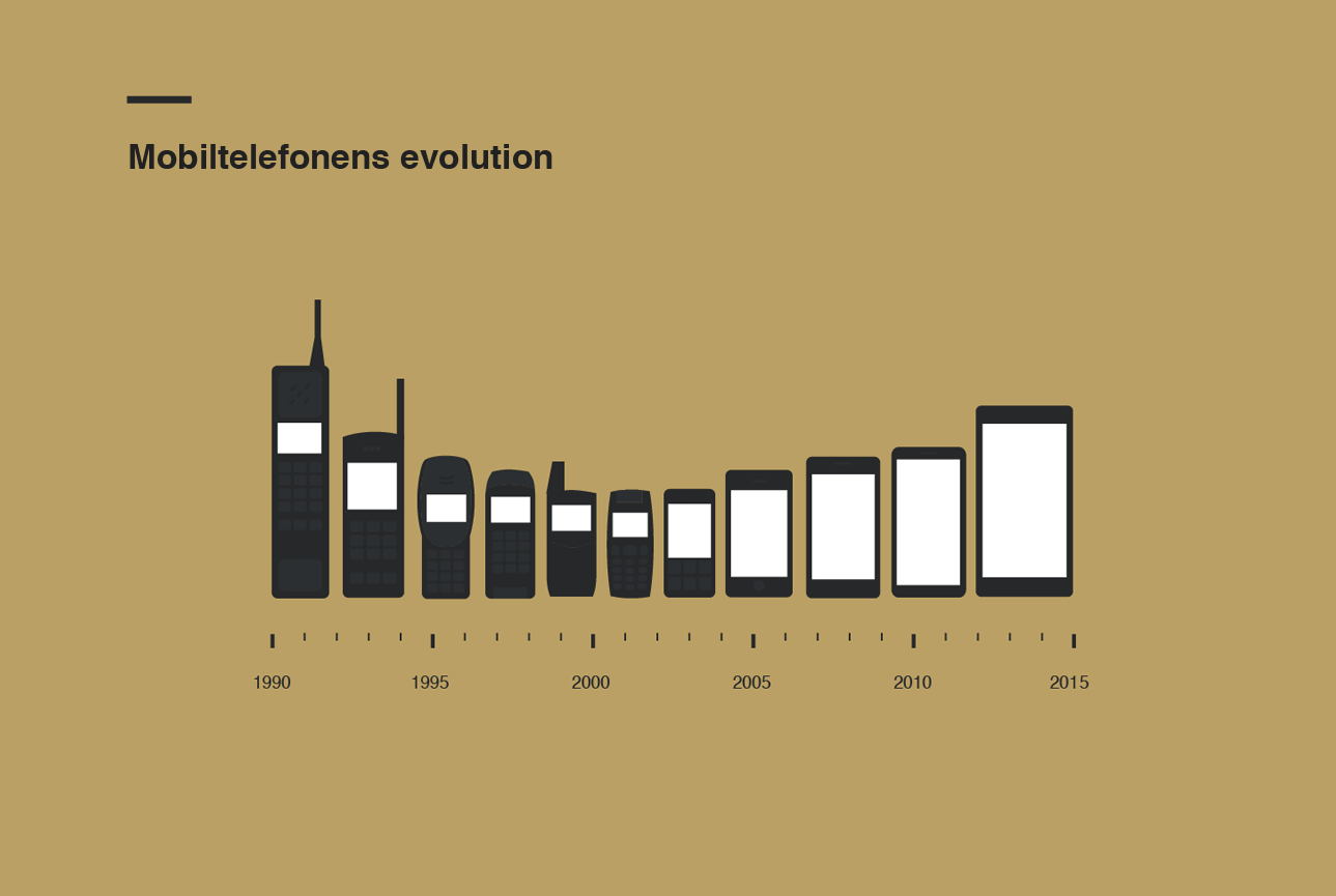
How true is it? Did phones become smaller and then grow again? This post began as an excuse to answer that question and see what Highcharter could do with a few thousand devices.
A snapshot from 2016
The original analysis collected specifications from GSMArena in March 2016. The old scraper is not executed here: websites change, selectors break and a historical post should not make thousands of requests every time it renders.
Fortunately, the final Highcharter widget contained its complete data as JSON. For this migration I recovered those points into local CSV files. The analysis therefore represents the same 2016 snapshot as the original article.
phones <- read_csv(
  "blog/posts/2016-03-01-bythmusters-mobile-phone-evolution/data/phones-2016.csv",
  show_col_types = FALSE
) |>
  mutate(
    launch_date = as.Date(launch_date),
    year = year(launch_date)
  )

brands <- read_csv(
  "blog/posts/2016-03-01-bythmusters-mobile-phone-evolution/data/brands-2016.csv",
  show_col_types = FALSE
)

phones <- phones |>
  left_join(
    brands |>
      select(brand, plot_color = color),
    by = "brand"
  )

phones |>
  select(launch_date, brand, model, height_mm) |>
  slice_head(n = 8)
# A tibble: 8 × 4
launch_date brand model height_mm
<date> <chr> <chr> <dbl>
1 2013-05-01 Spice Mi-450 Smartflo Ivory 132.
2 2013-05-01 Spice Mi-422 Smartflo Pace 126
3 2013-05-01 Spice Mi-353 Stellar Jazz 124.
4 2013-05-01 Spice Mi-725 Stellar Slatepad 194.
5 2013-05-01 Spice Mi-502 Smartflo Pace2 148
6 2013-05-01 Spice Mi-535 Stellar Pinnacle Pro 152
7 2013-01-01 Spice Mi-530 Stellar Pinnacle 152
8 2012-09-01 Spice Mi-500 Stellar Horizon 143 The recovered data contain 6,285 models from 99 brands, announced between 1999 and 2016.
This is not a market-share dataset. A brand with many regional variants or catalog entries will appear larger even if it did not sell more devices.
A lot of phones
Samsung had more than one thousand models in the original brand catalogue. That count includes variants and says more about the breadth of the catalogue than about commercial success.
brands |>
  slice_max(models, n = 20) |>
  mutate(brand = reorder(brand, models)) |>
  ggplot(aes(models, brand, fill = color)) +
  geom_col(width = 0.72) +
  geom_text(
    aes(label = scales::comma(models)),
    hjust = -0.15,
    size = 3.4
  ) +
  scale_fill_identity() +
  scale_x_continuous(
    labels = scales::comma,
    expand = expansion(mult = c(0, 0.1))
  ) +
  labs(
    title = "Brands with the largest phone catalogues",
    subtitle = "Models listed in the recovered GSMArena snapshot",
    x = "Number of models",
    y = NULL,
    caption = "Historical snapshot collected in March 2016"
  )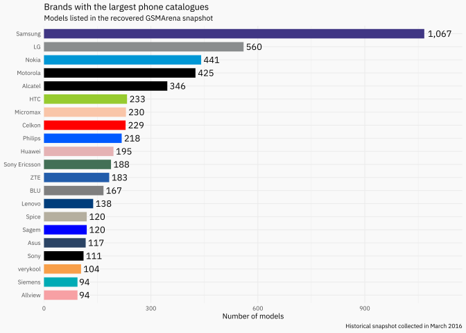
I know: too many colors. The original used each brand’s logo color because a neutral bar chart felt a little too responsible for an experiment called BythMusteR.
From small phones to large screens
The original dataset included phones, tablets, watches and a few devices that stretch the definition of a phone. We therefore focus on plausible handheld heights between 70 and 180 millimetres. This does not produce a perfect sample, but it makes the comparison more honest.
phones_analysis <- phones |>
  filter(
    !is.na(launch_date),
    between(height_mm, 70, 180)
  )

monthly_height <- phones_analysis |>
  mutate(month = floor_date(launch_date, "month")) |>
  summarise(
    median_height = median(height_mm),
    models = n(),
    .by = month
  ) |>
  arrange(month)

height_fit <- loess(
  median_height ~ as.numeric(month),
  data = monthly_height,
  span = 0.28
)

monthly_height <- monthly_height |>
mutate(fitted_height = predict(height_fit))ggplot(phones_analysis, aes(launch_date, height_mm)) +
geom_point(
aes(color = plot_color),
alpha = 0.16,
size = 1
) +
geom_line(
data = monthly_height,
aes(month, fitted_height),
inherit.aes = FALSE,
color = "#17324d",
linewidth = 1.3
) +
scale_color_identity() +
scale_x_date(date_breaks = "2 years", date_labels = "%Y") +
labs(
title = "Mobile phones became small, then large again",
subtitle = "Each point is one model; the line smooths monthly median height",
x = "Announcement date",
y = "Height (mm)",
caption = "Historical snapshot collected from GSMArena in 2016"
)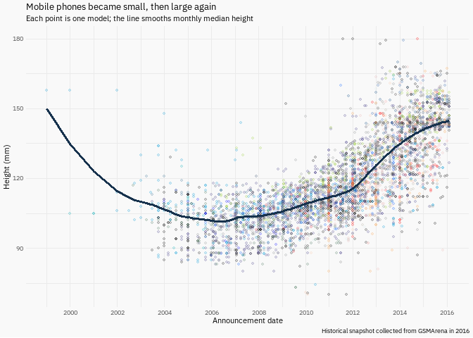
The familiar shape is there. Early mobile phones became progressively smaller. Around the smartphone transition, screens became the main interface and height started increasing again.
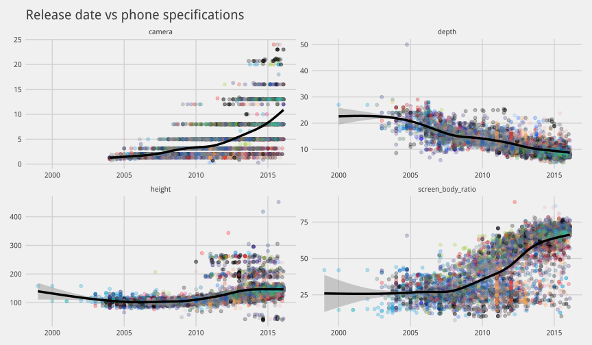
The original analysis also examined depth, camera resolution and screen-to-body ratio. The recovered height widget does not contain every one of those fields, so the original result is preserved below as a historical image rather than pretending those variables can be reconstructed.
Explore the phones
The interactive version highlights the iPhone and Galaxy S families while keeping every other model in the background. The curve is recalculated from the recovered data rather than copied from the old widget.
Code
galaxy_models <- c(
  "I9000 Galaxy S",
  "I9100G Galaxy S II",
  "I9300 Galaxy S III",
  "I9500 Galaxy S4",
  "Galaxy S5",
  "Galaxy S6",
  "Galaxy S6 edge",
  "Galaxy S7",
  "Galaxy S7 edge"
)

phones_chart_data <- phones_analysis |>
  mutate(
    family = case_when(
      str_detect(model, "^iPhone") ~ "iPhone",
      model %in% galaxy_models ~ "Galaxy S",
      TRUE ~ "Other phones"
    ),
    x = as.numeric(as.POSIXct(launch_date, tz = "UTC")) * 1000,
    y = height_mm,
    color = if_else(
      family == "Other phones",
      scales::alpha(plot_color, 0.18),
      plot_color
    )
  )

phone_points <- function(data) {
  data |>
    transmute(x, y, name = model, brand, color) |>
    purrr::pmap(function(x, y, name, brand, color) {
      list(x = x, y = y, name = name, brand = brand, color = color)
    }) |>
    unname()
}

other_phone_points <- phones_chart_data |>
  filter(family == "Other phones") |>
  phone_points()

iphone_points <- phones_chart_data |>
  filter(family == "iPhone") |>
  phone_points()

galaxy_points <- phones_chart_data |>
  filter(family == "Galaxy S") |>
  phone_points()

trend_points <- monthly_height |>
  filter(!is.na(fitted_height)) |>
  transmute(
    x = as.numeric(as.POSIXct(month, tz = "UTC")) * 1000,
    y = fitted_height
  ) |>
  highcharter::list_parse()
Code
phone_chart <- highchart() |>
  hc_chart(type = "scatter", zoomType = "xy") |>
  hc_title(text = "Release date versus phone height") |>
  hc_subtitle(text = "A recovered snapshot of 6,285 models through March 2016") |>
  hc_xAxis(
    type = "datetime",
    title = list(text = "Announcement date")
  ) |>
  hc_yAxis(
    min = 70,
    max = 180,
    title = list(text = "Height (mm)")
  ) |>
  hc_add_series(
    data = other_phone_points,
    name = "Other phones",
    turboThreshold = 0,
    marker = list(symbol = "circle", radius = 2),
    zIndex = 1
  ) |>
  hc_add_series(
    data = galaxy_points,
    name = "Galaxy S",
    turboThreshold = 0,
    color = "#403684",
    marker = list(symbol = "circle", radius = 4),
    dataLabels = list(enabled = TRUE, format = "{point.name}"),
    zIndex = 3
  ) |>
  hc_add_series(
    data = iphone_points,
    name = "iPhone",
    turboThreshold = 0,
    color = "#333333",
    marker = list(symbol = "circle", radius = 4),
    dataLabels = list(enabled = TRUE, format = "{point.name}"),
    zIndex = 3
  ) |>
  hc_add_series(
    data = trend_points,
    name = "Trend",
    type = "spline",
    color = "#17324d",
    lineWidth = 3,
    marker = list(enabled = FALSE),
    enableMouseTracking = FALSE,
    zIndex = 2
  ) |>
  hc_tooltip(
    useHTML = TRUE,
    backgroundColor = "rgb(244, 246, 248)",
    borderWidth = 0,
    pointFormat = paste0(
      '<div style="padding:8px;background:#f4f6f8;color:#17324d;opacity:1">',
      '<b>{point.name}</b><br>{point.brand}<br>{point.y:.1f} mm',
      '</div>'
    )
  ) |>
  hc_credits(enabled = FALSE) |>
  hc_size(height = 720)

phone_chart
The cartoon exaggerates the story, but it gets the direction surprisingly right. Miniaturization dominated one era; the screen transformed what a phone was, and the device grew around it.
References
- GSMArena. Device specifications — collected in March 2016.
- The local CSV files were recovered from the JSON embedded in the original Highcharter widgets.
-
source/extract_highchart_data.Rdocuments the recovery process; it reads only the archived local HTML files and performs no web scraping.