Adding motion to choropleths

Using the Highcharts motion plugin to animate a choropleth map.
maps
highcharter
animation
Author

Joshua Kunst

Published

April 12, 2016

Modified

August 14, 2026

A while ago I saw an R reproduction of a New York Times visualization about drug overdose deaths in the United States. The result we hope is like this:

I really like small multiples and this is a good example of usage. However if the multiples means a lot mini plots maybe you can try add animation.
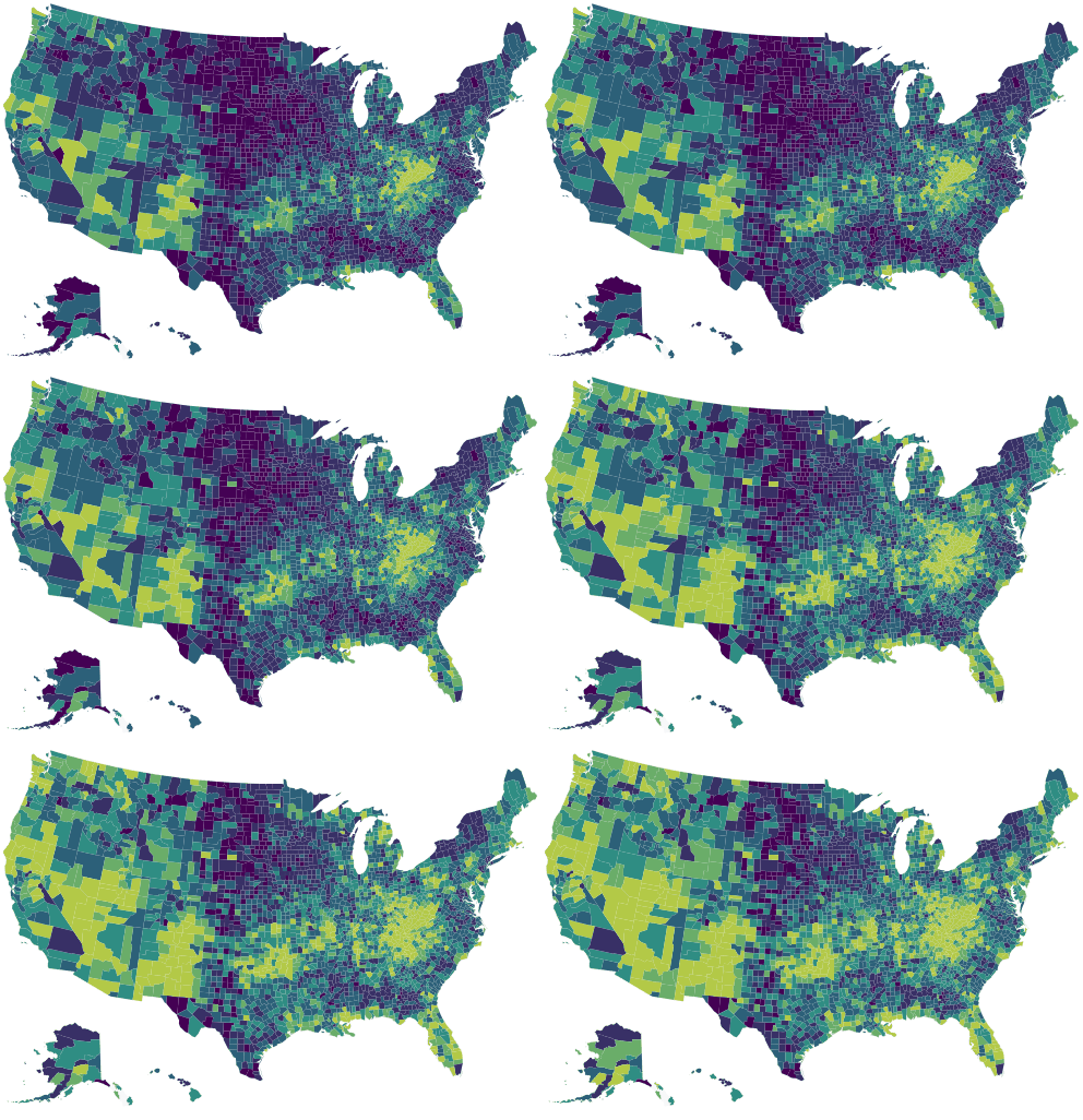
Let’s start using the script made by Bob:

Code
library(jsonlite)
library(dplyr)
library(tidyr)
library(highcharter)

data("uscountygeojson")
data("unemployment")

data <- fromJSON("data/drug-deaths.json") %>% 
  as_tibble() %>% 
  pivot_longer(-fips, names_to = "year", values_to = "value") %>% 
  mutate(year = sub("^y", "", year),
         value = ifelse(is.na(value), 0, value))

data
# A tibble: 40,833 × 3
   fips  year  value
   <chr> <chr> <dbl>
 1 01001 2002      1
 2 01001 2003      1
 3 01001 2004      1
 4 01001 2005      1
 5 01001 2006      1
 6 01001 2007      1
 7 01001 2008      1
 8 01001 2009      1
 9 01001 2010      1
10 01001 2011      1
# ℹ 40,823 more rows

Now we’ll prepare the data as the motion plugin require the data.

Code
ds <- data %>%
  arrange(year) %>%
  group_by(fips) %>% 
  summarise(
    sequence = list(value),
    value = first(value),
    .groups = "drop"
  ) %>%
  purrr::pmap(
    function(fips, sequence, value) {
      list(fips = fips, sequence = sequence, value = value)
    }
  )

hc <- highchart(type = "map") %>% 
  hc_add_series(
    data = ds,
    name = "drug deaths per 100,000",
    mapData = uscountygeojson,
    joinBy = "fips",
    borderWidth = 0.01
    ) %>% 
  hc_colorAxis(stops = color_stops()) %>%  
  hc_title(text = "How the Epidemic of Drug Overdose Deaths Ripples") %>% 
  hc_subtitle(text = "Overdose deaths per 100,000") %>% 
  hc_legend(
    layout = "horizontal",
    reversed = TRUE,
    floating = TRUE,
    align = "right"
    ) %>% 
  hc_motion(
    enabled = TRUE,
    axisLabel = "year",
    labels = sort(unique(data$year)),
    series = 0,
    updateInterval = 50,
    magnet = list(
      round = "floor",
      step = 0.1
    )
  ) %>% 
  hc_chart(marginBottom  = 100)

And the result:

Code
hc