This post asks whether the same data can be shown in different ways to tell the wait, is this really happening? story more clearly.
Some time ago, an animated spiral showing the evolution of global temperature anomalies began circulating online.
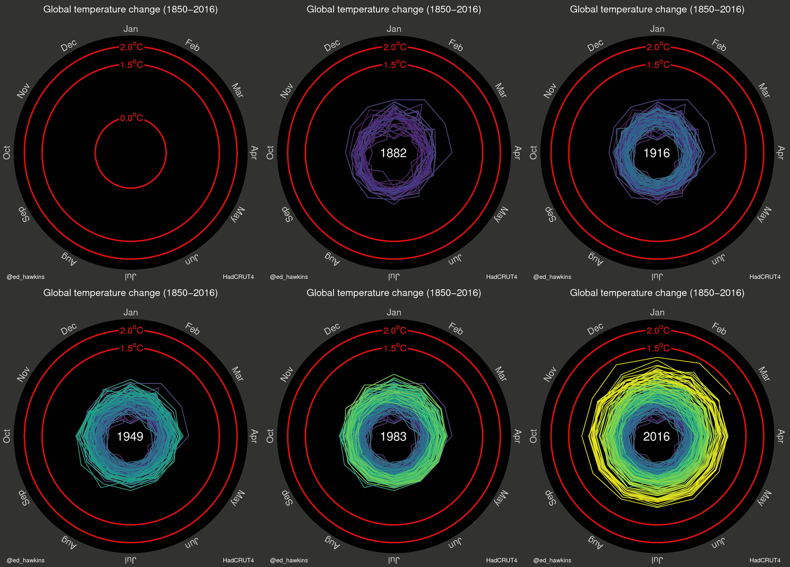
Several sites described it as one of the most convincing climate change visualizations. That may be a slightly clickbait-ish title, but at least it says visualization :B.
Animation can be compelling, but it does not always make comparison easier. It asks us to compare what we are seeing now with what we remember seeing a few seconds ago.

The spiral also accumulates many overlapping lines near the end. The overall direction is clear, while the pace and uncertainty of the change are harder to inspect. Let us keep the same data and try a few alternatives.
Data and packages
The data are a local snapshot of the HadCRUT temperature anomaly dataset shared by Bob Rudis. Keeping the file beside the post means the historical article no longer depends on a remote download during every render.
temperature_data <- read_csv(
  "blog/posts/2016-06-23-case-study-animation-and-other-visualizations/data/temps.csv",
  show_col_types = FALSE
) |>
  mutate(
    date = ymd(year_mon),
    timestamp = as.numeric(as.POSIXct(date, tz = "UTC")) * 1000,
    year = as.integer(year),
    month = factor(month, levels = month.abb),
    month_color = scales::alpha(
      highcharter::colorize(median, viridisLite::viridis(10, option = "B")),
      0.68
    )
  )

year_colors <- temperature_data |>
  summarise(median = median(median), .by = year) |>
  mutate(
    year_color = scales::alpha(
      highcharter::colorize(median, viridisLite::viridis(10, option = "B")),
      0.72
    )
  ) |>
  select(year, year_color)

temperature_data <- temperature_data |>
  left_join(year_colors, by = "year")

temperature_data |>
  select(date, median, lower, upper, year, month) |>
  slice_head(n = 6)
# A tibble: 6 × 6
date median lower upper year month
<date> <dbl> <dbl> <dbl> <int> <fct>
1 1850-01-01 -0.702 -1.10 -0.299 1850 Jan
2 1850-02-01 -0.281 -0.673 0.117 1850 Feb
3 1850-03-01 -0.732 -1.08 -0.382 1850 Mar
4 1850-04-01 -0.569 -0.904 -0.237 1850 Apr
5 1850-05-01 -0.326 -0.662 0.005 1850 May
6 1850-06-01 -0.212 -0.515 0.085 1850 Jun The observations begin in 1850 and end in 2015. Each monthly estimate includes a median anomaly and lower and upper uncertainty bounds.
The spiral
First, let us reproduce the idea without animation. Every year becomes a polar line and every position around the circle represents a month.
year_series <- temperature_data |>
  arrange(year, date) |>
  group_split(year) |>
  map(function(year_data) {
    list(
      name = as.character(first(year_data$year)),
      data = year_data$median,
      color = first(year_data$year_color)
    )
  })
spiral_chart <- highchart() |>
hc_chart(polar = TRUE, type = "line") |>
hc_title(text = "Global temperature anomalies by year") |>
hc_subtitle(text = "Each turn of the spiral represents January to December") |>
hc_xAxis(
categories = month.abb,
tickmarkPlacement = "on",
lineWidth = 0
) |>
hc_yAxis(
title = list(text = NULL),
labels = list(format = "{value} °C")
) |>
hc_plotOptions(
series = list(
marker = list(enabled = FALSE),
lineWidth = 1,
animation = FALSE
)
) |>
hc_add_series_list(year_series) |>
hc_legend(enabled = FALSE) |>
hc_tooltip(
headerFormat = "<b>{series.name}</b><br>",
pointFormat = "{point.category}: {point.y:.2f} °C"
) |>
hc_credits(enabled = FALSE)
spiral_chartWithout the animation, the spiral loses much of its rhetorical force. We can restore that component by creating the series as transparent lines and revealing them one by one.
animated_year_series <- temperature_data |>
  arrange(year, date) |>
  group_split(year) |>
  map(function(year_data) {
    list(
      name = as.character(first(year_data$year)),
      data = year_data$median,
      color = "transparent",
      enableMouseTracking = FALSE,
      custom = list(revealColor = first(year_data$year_color))
    )
  })
Code
animated_spiral <- highchart() |>
  hc_chart(
    polar = TRUE,
    type = "line",
    events = list(
      load = htmlwidgets::JS(
        "function () {
          var chart = this;
          var duration = 16000;
          var interval = duration / chart.series.length;

          chart.series.forEach(function (series, index) {
            window.setTimeout(function () {
              series.update({
                color: series.options.custom.revealColor,
                enableMouseTracking: true
              }, false);
              chart.setTitle({ text: series.name });
              chart.redraw();
            }, 900 + index * interval);
          });
        }"
      )
    )
  ) |>
  hc_title(text = "Animated spiral") |>
  hc_subtitle(text = "Years appear in chronological order") |>
  hc_xAxis(
    categories = month.abb,
    tickmarkPlacement = "on",
    lineWidth = 0
  ) |>
  hc_yAxis(
    title = list(text = NULL),
    labels = list(format = "{value} °C")
  ) |>
  hc_plotOptions(
    series = list(
      marker = list(enabled = FALSE),
      lineWidth = 1,
      animation = FALSE
    )
  ) |>
  hc_add_series_list(animated_year_series) |>
  hc_legend(enabled = FALSE) |>
  hc_tooltip(
    headerFormat = "<b>{series.name}</b><br>",
    pointFormat = "{point.category}: {point.y:.2f} °C"
  ) |>
  hc_credits(enabled = FALSE)

animated_spiral
And voilà. The sequence is memorable, although comparing distant years still depends on memory.
Seasonal lines
Do we need polar coordinates? We can return to Euclidean space while preserving the same month-by-month structure.
seasonal_chart <- highchart() |>
  hc_chart(type = "spline") |>
  hc_title(text = "Temperature anomalies through the year") |>
  hc_subtitle(text = "One line for every year") |>
  hc_xAxis(categories = month.abb) |>
  hc_yAxis(
    title = list(text = NULL),
    labels = list(format = "{value} °C")
  ) |>
  hc_plotOptions(
    series = list(
      marker = list(enabled = FALSE),
      lineWidth = 1,
      animation = FALSE
    )
  ) |>
  hc_add_series_list(year_series) |>
  hc_legend(enabled = FALSE) |>
  hc_tooltip(
    headerFormat = "<b>{series.name}</b><br>",
    pointFormat = "{point.category}: {point.y:.2f} °C"
  ) |>
  hc_credits(enabled = FALSE)

seasonal_chart
Nice colored spaghetti, but not a particularly clear account of what happened across the full period.
Heatmap
Another option is to place years along the horizontal axis and months along the vertical axis.
heatmap_chart <- hchart(temperature_matrix) |>
  hc_title(text = "Monthly temperature anomalies") |>
  hc_subtitle(text = "Month by year") |>
  hc_colorAxis(
    stops = highcharter::color_stops(
      10,
      viridisLite::viridis(10, option = "B")
    ),
    min = -1,
    max = 1
  ) |>
  hc_yAxis(title = list(text = NULL)) |>
  hc_credits(enabled = FALSE)

heatmap_chart
The warmer final years are visible, but color alone makes the magnitude of the change less direct to quantify.
A simple time series
Now the simplest chart: place every observation in chronological order.
time_series_data <- temperature_data |>
  transmute(
    x = timestamp,
    y = median,
    name = paste(month, year)
  ) |>
  highcharter::list_parse()
time_series_chart <- highchart() |>
hc_chart(type = "line", zoomType = "x") |>
hc_title(text = "Global temperature anomalies") |>
hc_subtitle(text = "Monthly estimates through time") |>
hc_xAxis(type = "datetime") |>
hc_yAxis(
title = list(text = NULL),
labels = list(format = "{value} °C")
) |>
hc_add_series(
data = time_series_data,
name = "Global temperature",
color = viridisLite::viridis(10, option = "B")[7],
lineWidth = 1,
marker = list(enabled = FALSE),
turboThreshold = 0
) |>
hc_credits(enabled = FALSE)
time_series_chartPerhaps it is too simple. Or perhaps simplicity is the point.
Showing uncertainty
Finally, we can add the lower and upper bounds. A column-range chart keeps the time ordering, exposes uncertainty and uses color to guide attention toward the most recent warming.
range_chart <- highchart() |>
  hc_chart(type = "columnrange", zoomType = "x") |>
  hc_title(text = "Global temperature anomalies and uncertainty") |>
  hc_subtitle(text = "Monthly lower and upper estimates") |>
  hc_xAxis(type = "datetime") |>
  hc_yAxis(
    title = list(text = NULL),
    labels = list(format = "{value} °C")
  ) |>
  hc_add_series(
    data = range_data,
    name = "Global temperature",
    turboThreshold = 0
  ) |>
  hc_legend(enabled = FALSE) |>
  hc_tooltip(
    pointFormat = "<b>{point.name}</b><br>{point.low:.2f} to {point.high:.2f} °C"
  ) |>
  hc_credits(enabled = FALSE)

range_chart
For me, this version communicates the argument most directly:
- Chronological position makes the past and present easy to compare.
- The interval preserves information hidden by a single line.
- The yellowish final section guides the eye without requiring animation.
Animation is not good or bad by itself. It is a choice about what the reader should notice, remember and compare.

Do you have another way to represent these data?