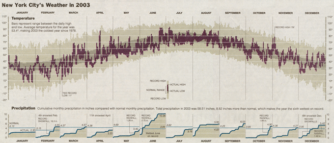
Recreating an interactive New York Times weather chart with highcharter.
data-visualization
highcharter
Author
Joshua Kunst
Published
December 2, 2016
Modified
August 13, 2026
So much time since my last post so I want to post something, no matter what it is, but I hope this will be somehow helpfull
In this post I will show some new features for the next version of highcharter package. The main feature added is hc_add_series now is a generic function! This mean you can add the data argument can be numeric, data frame, time series (ts, xts, ohlc) amonth others so the syntaxis will be a little cleaner.
What we’ll do here? We’ll make an interactive version of the well-well-know-and-a-little-repeated Tufte weather chart.
But our focus will be replicate the New York Time App: How Much Warmer Was Your City in 2015? where you can choose among over 3K cities!. So let’s start. So we need a interactive charting library.
Data
If you search/explore in the devTools in the previous link you can know where is the path of the used data. So to be clear:
All the data used in this post is from http://www.nytimes.com – Me.
We’ll load the tidyverse, download the data, and create an auxiliar variable dt to store the date time in numeric format.
We’ll select the temperature columns from the data and do some wrangling, gather, spread, separate and recodes to get a nice tidy data frame.
dtempgather<-data%>%select(dt, starts_with("temp"))%>%select(-temp_rec_high,-temp_rec_low)%>%rename(temp_actual_max =temp_max, temp_actual_min =temp_min)%>%gather(key, value,-dt)%>%mutate(key =str_replace(key, "temp_", ""))dtempspread<-dtempgather%>%separate(key, c("serie", "type"), sep ="_")%>%spread(type, value)temps<-dtempspread%>%mutate( serie =factor(serie, levels =c("rec", "avg", "actual")), serie =fct_recode(serie, Record ="rec", Normal ="avg", Observed ="actual"))temps
# A tibble: 1,095 × 4
              dt serie      max   min
           <dbl> <fct>    <dbl> <dbl>
 1 1420070400000 Observed    39    27
 2 1420070400000 Normal      39    28
 3 1420070400000 Record      62    -4
 4 1420156800000 Observed    42    35
 5 1420156800000 Normal      39    28
 6 1420156800000 Record      68     2
 7 1420243200000 Observed    42    33
 8 1420243200000 Normal      39    28
 9 1420243200000 Record      64    -4
10 1420329600000 Observed    56    41
# ℹ 1,085 more rows
Now whe can add this data to the highchart object using hc_add_series:
hc<-hc%>%hc_add_series(temps, type ="columnrange",hcaes(dt, low =min, high =max, group =serie), color =c("#ECEBE3", "#C8B8B9", "#A90048"))hc
A really similar chart of what we want!
The original chart show records of temprerature. So we need to filter the days with temperature records using the columns temp_rec_high and temp_rec_low, then some gathers and tweaks. Then set some options to show the points, like use fill color and some longer radius.
records<-data%>%select(dt, temp_rec_high, temp_rec_low)%>%filter(temp_rec_high!="NULL"|temp_rec_low!="NULL")%>%mutate_if(is.character, str_extract, "\\d+")%>%mutate_if(is.character, as.numeric)%>%gather(type, value,-dt)%>%filter(!is.na(value))%>%mutate(type =str_replace(type, "temp_rec_", ""), type =paste("This year record", type))pointsyles<-list( symbol ="circle", lineWidth =1, radius =4, fillColor ="#FFFFFF", lineColor =NULL)records
# A tibble: 9 × 3
             dt type                  value
          <dbl> <chr>                 <dbl>
1 1439769600000 This year record high    95
2 1441670400000 This year record high    97
3 1446768000000 This year record high    74
4 1449964800000 This year record high    67
5 1450051200000 This year record high    67
6 1450137600000 This year record high    68
7 1450915200000 This year record high    72
8 1451001600000 This year record high    66
9 1424390400000 This year record low      2
hc<-hc%>%hc_add_series(records, "point", hcaes(x =dt, y =value, group =type), marker =pointsyles)hc
We’re good.
Precipitation
A nice feture of the NYTs app is and the chart is show the precipitaion by month. This data is in other axis. So we need to create a list with 2 axis using the create_axis helper and then add these axes to the chart.
The 2 axis are ready, now we need add the data. We will add 12 series -one for each month- but we want to asociate 1 legend for all these 12 series, so we need to use id and linkedTo parameters and obviously. That’s why the id will be a 'p' for the firt element and then NA to the other 11. And then linked this 11 to the first series (id = 'p').
precip<-select(data, dt, precip_value, month)hc<-hc%>%hc_add_series(precip, type ="area",hcaes(dt, precip_value, group =month), name ="Precipitation", color ="#008ED0", lineWidth =1, yAxis =1, fillColor ="#EBEAE2", id =c("p", rep(NA, 11)), linkedTo =c(NA, rep("p", 11)))
The same way we’ll add the normal precipitations by month.