Post updated on Oct 01, 2024
This is pure nerdism. There is a project to create a shapfile from a fictional world, the Middle Earth. The data is in this https://github.com/jvangeld/ME-GIS repository. The author of the r-chart.com web site made a ggplot version of this map which you can see in this link.
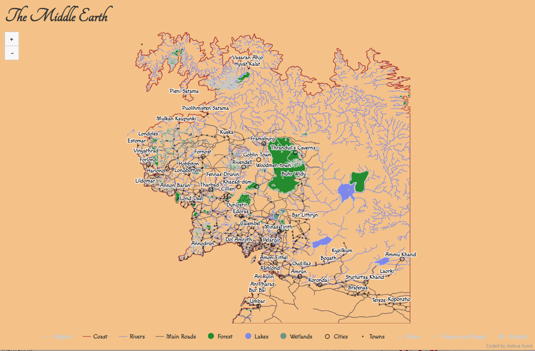
Well, as the highcharter developer I wanted to try to made this map using this package and add some styles to give the old magic fashioned Middle Earth look. My try to achieve this…

Just because we can – Me.
… Is summarized as:
- Use the
#F4C283color as background. - use the Tangerine font in the title and Macondo in the legends, tooltips and labels.
- Search hexadecimal color forest to get the the colors for forests.
The packages to made this possible were:
Note we used the rmapshaper package (wapper for the mapshaper js library) to simplify the rivers beacuse this file is kind of huge to put in a htmlwidget.
I made some auxiliar functions to simplify the shapefile and to convert this info in geojson format using the geojsonio package.
Code
fldr <- here::here("posts", "2016-12-15-interactive-and-styled-middle-earth-map", "data")
shp_to_geoj_smpl <- function(file = "Towns.shp", k = 0.5) {
d <- readShapeSpatial(file.path(fldr, file))
d <- ms_simplify(d, keep = k)
d <- geojson_list(d)
geojsonio::geojson_write(d, file = str_replace(file.path(fldr, file), "shp$", "geojson"))
d
}
shp_points_to_geoj <- function(file = "Cities.shp"){
outp <- readShapeSpatial(file.path(fldr, file))
names(outp) <- str_to_title(names(outp))
outp$Name <- stringi::stri_trans_general(outp$Name, "latin-ascii")
outp <- geojson_json(outp)
geojsonio::geojson_write(outp, file = str_replace(file.path(fldr, file), "shp$", "geojson"))
outp
}
dir(fldr) %>%
str_subset(".shp") [1] "Beacons.shp" "Citadels.shp"
[3] "Cities.shp" "Coastline2.shp"
[5] "Combined_Placenames.shp" "Contours_18.shp"
[7] "Forests.shp" "Hamlets.shp"
[9] "HelperContours.shp" "Hills.shp"
[11] "Lakes.shp" "Mountains_Anno.shp"
[13] "Regions_Anno.shp" "Rivers.shp"
[15] "Roads.shp" "Ruins.shp"
[17] "Stonefields.shp" "Towers_and_Keeps.shp"
[19] "Towns.shp" "Vulcanism.shp"
[21] "Wetlands02.shp" Code
cstln <- shp_to_geoj_smpl("Coastline2.shp", .65)
hlprs <- shp_to_geoj_smpl("HelperContours.shp", .65)
rvers <- shp_to_geoj_smpl("Rivers.shp", .01)
frsts <- shp_to_geoj_smpl("Forests.shp", 0.90)
lakes <- shp_to_geoj_smpl("Lakes.shp", 0.1)
wlnds <- shp_to_geoj_smpl("Wetlands02.shp", 0.1)
roads <- shp_to_geoj_smpl("Roads.shp", 1)
ruins <- shp_points_to_geoj("Ruins.shp")
towrs <- shp_points_to_geoj("Towers_and_Keeps.shp")
ctdls <- shp_points_to_geoj("Citadels.shp")
cties <- shp_points_to_geoj("Cities.shp")
towns <- shp_points_to_geoj("Towns.shp")
pointsyles <- list(
symbol = "circle",
lineWidth= 1,
radius= 4,
fillColor= "transparent",
lineColor= NULL
)Now, to create the chart we need to add the geographic info one by one setting the type of info:
-
mappointfor cities. -
maplinefor rivers and the coast. - And
mapfor lakes and forests.
Code
hcme <- highchart(type = "map") %>%
hc_chart(style = list(fontFamily = "Macondo"), backgroundColor = "#F4C283") %>%
hc_title(text = "The Middle Earth", style = list(fontFamily = "Tangerine", fontSize = "40px")) %>%
# hc_add_series(data = hlprs, type = "mapline", color = "brown", name = "Helpers", visible = FALSE) %>%
hc_add_series(data = cstln, type = "mapline", color = "brown", name = "Coast") %>%
hc_add_series(data = rvers, type = "mapline", color = "#7e88ee", name = "Rivers") %>%
hc_add_series(data = roads, type = "mapline", color = "#634d53", name = "Main Roads") %>%
hc_add_series(data = frsts, type = "map", color = "#228B22", name = "Forest") %>%
hc_add_series(data = lakes, type = "map", color = "#7e88ee", name = "Lakes") %>%
hc_add_series(data = wlnds, type = "map", color = "#689689", name = "Wetlands") %>%
hc_add_series(
data = cties, type = "mappoint", color = "black", name = "Cities",
dataLabels = list(enabled = TRUE), marker = list(radius = 4, lineColor = "black")
) %>%
hc_add_series(
data = towns, type = "mappoint", color = "black", name = "Towns",
dataLabels = list(enabled = TRUE), marker = list(radius = 1, fillColor = "rgba(190,190,190,0.7)")
) %>%
hc_add_series(
data = ruins, type = "mappoint", color = "black", name = "Ruins", visible = FALSE,
dataLabels = list(enabled = TRUE), marker = list(radius = 2, lineColor = "black")
) %>%
hc_add_series(
data = towrs, type = "mappoint", color = "black", name = "Towers and Keeps", visible = FALSE,
dataLabels = list(enabled = TRUE), marker = list(radius = 2, lineColor = "black")
) %>%
hc_add_series(
data = ctdls , type = "mappoint", color = "black", name = "Citadels", visible = FALSE,
dataLabels = list(enabled = TRUE), marker = list(radius = 4, lineColor = "black")
) %>%
hc_plotOptions(
series = list(
marker = pointsyles,
dataLabels = list(enabled = FALSE, format = '{point.properties.Name}')
)
) %>%
hc_mapNavigation(enabled = TRUE, enableMouseWheelZoom = FALSE) %>%
hc_size(height = 800)And you have a super styled chart using only R :D!
Code
hcme