Recreating a quiet chart designed to blend into its surrounding web page.
data-visualization
highcharter
Author
Joshua Kunst
Published
April 8, 2019
Modified
August 13, 2026
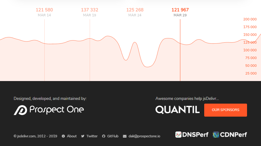
I was searching for a CDN at jsdelivr.com and I noticed a chart showing download per days:
Why I like this chart? Because is a chart integrated with the web site using all space and soft colors to not call the attention. A very special chart.
Now we’ll try to replicate :). That’s why we’re are here. Let’s download the data:
Remove the lables and reduce number of axis ticks.
A lot of tweaks!
And the most important step in this chart: use all the space, reducing the margins and move the x-axis labels to the inner side. Using the l-screen option in distill package.
Code
color_theme<-"#E76235"# extracted with chrome extensionhchart(datag, "areaspline", hcaes(date, downloads), name ="Downloads")%>%hc_xAxis( title =list(text =NULL), opposite =TRUE, gridLineWidth =1, gridLineColor =color_theme, # vertical lines tickColor =color_theme, lineColor ="transparent", # horizontal line, labels =list(style =list(color =color_theme, fontSize ="16px")), tickInterval =8*24*3600*1000# interval of 1 day (in your case = 60))%>%hc_yAxis( title =list(text =""), opposite =TRUE, gridLineColor ="transparent", showFirstLabel =FALSE, labels =list( style =list(color =color_theme, fontSize ="16px"), align ="left", x =-100))%>%hc_plotOptions( series =list( color =color_theme, fillColor =hex_to_rgba(color_theme, 0.20), marker =list(enabled =FALSE)))%>%hc_chart( spacingBottom =0, spacingLeft =-6, spacingRight =-55# just plying to get these numbers)%>%hc_size(height =300)
Source Code
---title: "When charts are integrated in the web page"description: Recreating a quiet chart designed to blend into its surrounding web page.date: 2019-04-08date-modified: 2026-08-13categories: [data-visualization, highcharter]image: images/preview.pngresources: - images/jsdelivr.png---```{r setup, include=FALSE}source(here::here("blog", "_R", "post_setup.R"))install_missing_packages(c("tidyverse", "jsonlite", "lubridate", "highcharter"))```I was searching for a CDN at jsdelivr.com and I noticed a chart showing download per days::::{.column-body}:::Why I like this chart? Because is a chart integratedwith the web site using all space and soft colors to notcall the attention. A very special chart.Now we'll try to replicate :). That's why we're are here. Let'sdownload the data:```{r load-jsdelivr-downloads}library(tidyverse)library(jsonlite)library(lubridate)library(highcharter)data <- jsonlite::read_json("https://data.jsdelivr.com/v1/package/npm/highcharts/stats/month")# str(data)data <- data$versions %>%map( ~ .x$dates) %>%enframe() %>%mutate(value =map(value, enframe)) %>%unnest() %>%mutate(value =map_dbl(value, identity),name1 =ymd(name1) )data```We'll group the data by day:```{r aggregate-download-data}datag <- data %>%group_by(name1) %>%summarise(value =sum(value)) %>%rename(date = name1,downloads = value )datag```And we're ready to our first try:```{r build-basic-download-chart}hc <-hchart(datag, "line", hcaes(date, downloads))hc```> Just According to KeikakuNow, there are some changes we need to do:- Change line to area spline.- Put every axis in the opposite side.- Clean the axis and use a bigger font size.- Remove the lables and reduce number of axis ticks.- A lot of tweaks!- And the most important step in this chart: use all the space,reducing the margins and move the x-axis labels to the inner side. Using the `l-screen`option in distill package.```{r build-integrated-download-chart}#| column: screencolor_theme <-"#E76235"# extracted with chrome extensionhchart(datag, "areaspline", hcaes(date, downloads), name ="Downloads") %>%hc_xAxis(title =list(text =NULL),opposite =TRUE,gridLineWidth =1,gridLineColor = color_theme, # vertical linestickColor = color_theme,lineColor ="transparent", # horizontal line,labels =list(style =list(color = color_theme, fontSize ="16px")),tickInterval =8*24*3600*1000# interval of 1 day (in your case = 60) ) %>%hc_yAxis(title =list(text =""),opposite =TRUE,gridLineColor ="transparent",showFirstLabel =FALSE,labels =list(style =list(color = color_theme, fontSize ="16px"),align ="left",x =-100 ) ) %>%hc_plotOptions(series =list(color = color_theme,fillColor =hex_to_rgba(color_theme, 0.20),marker =list(enabled =FALSE) ) ) %>%hc_chart(spacingBottom =0,spacingLeft =-6,spacingRight =-55# just plying to get these numbers ) %>%hc_size(height =300)```