Introducction
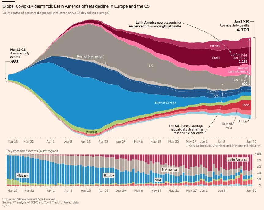
Week ago I see a tweet from Steven Bernard @sdbernard from Financial Times showing a streamgraph on the top of a stacked column chart. I take a look some seconds and then boom: What a combination! Why?
One of them is the complement of the other.
The link for the original source is here.
I like the streamgraph but it is hard to see the change the distribution between categories when the total change sudden. So have this auxiliar chart is a nice add to don’t loose from sigth the distribution.
Data
In this post we will use the Our Workd In Data Covid deaths (link here) because I’m not sure what is the data used by Financial Times team.
We’ll load the data and check the structure and get only what we need to replitcate the chart:
# A tibble: 7 × 2
  continent         n
  <chr>         <int>
1 Africa        95419
2 Asia          84199
3 Europe        91031
4 North America 68638
5 Oceania       40183
6 South America 23440
7 <NA>          26525
Rows: 402,910
Columns: 5
$ continent  <chr> "Asia", "Asia", "Asia", "Asia", "Asia", "Asia", "Asia", "As…
$ iso_code   <chr> "AFG", "AFG", "AFG", "AFG", "AFG", "AFG", "AFG", "AFG", "AF…
$ date       <date> 2020-01-05, 2020-01-06, 2020-01-07, 2020-01-08, 2020-01-09…
$ location   <chr> "Afghanistan", "Afghanistan", "Afghanistan", "Afghanistan",…
$ new_deaths <dbl> 0, 0, 0, 0, 0, 0, 0, 0, 0, 0, 0, 0, 0, 0, 0, 0, 0, 0, 0, 0,…
FT used the 7-day rolling average in the chart so we’ll use the {RcppRoll} package to get that series for each contienent. Check the next code to see how the function roll_meanr works.
[1] NA NA 2 3 4 5 6 7 8 9
Now we need to group the data to calculate the roll mean for every country/location and then filter to reduce some noise.
The chart show continent so we’ll group by date and continent.
Rows: 876
Columns: 3
Groups: date [146]
$ date       <date> 2020-03-16, 2020-03-16, 2020-03-16, 2020-03-16, 2020-03-16…
$ continent  <chr> "Africa", "Asia", "Europe", "North America", "Oceania", "So…
$ new_deaths <dbl> 0, 91, 277, 7, 0, 1, 2, 165, 1158, 47, 0, 8, 15, 194, 2676,…
The streamgraph
Before combine two charts we need to know how to get every chart independently. Let’s start with the main one:
A good start, but we can do it better. So, some considerations:
- The yAxis don’t have a meaning in the streamgraph so we’ll remove it.
- We can set
endOnTick and startOnTick en yAxis to gain some extra vertical space.
- Remove the vertical lines to get a more clear chart.
- Get a better tooltip (
table = TRUE).
- In this case but we can try adding labels to each series instead of using legend, same as the FT chart.
- This is not associate to the chart itself but what is representing: In the original FT chart some countries like UK, US are separated for their continent because are relevant, and then the color used is similar to their continent to get the visual association.
To separate the information for some coutries from theirs continent we’ll create a grp variable:
# A tibble: 13 × 3
   continent     grp                n
   <chr>         <chr>          <int>
 1 Africa        Africa          8322
 2 Asia          Asia            7303
 3 Asia          India            146
 4 Europe        Europe          7790
 5 Europe        Russia           146
 6 Europe        United Kingdom   146
 7 North America Mexico           146
 8 North America North America   5694
 9 North America United States    146
10 Oceania       Oceania         3504
11 South America Brazil           146
12 South America Chile            146
13 South America South America   1752
Fun part #1: To the continent which have separated countries will add the "Rest of " to be specific this is no the total continent.
# A tibble: 13 × 3
   continent     grp                       n
   <chr>         <chr>                 <int>
 1 Africa        Africa                 8322
 2 Asia          India                   146
 3 Asia          Rest of Asia           7303
 4 Europe        Rest of Europe         7790
 5 Europe        Russia                  146
 6 Europe        United Kingdom          146
 7 North America Mexico                  146
 8 North America Rest of North America  5694
 9 North America United States           146
10 Oceania       Oceania                3504
11 South America Brazil                  146
12 South America Chile                   146
13 South America Rest of South America  1752
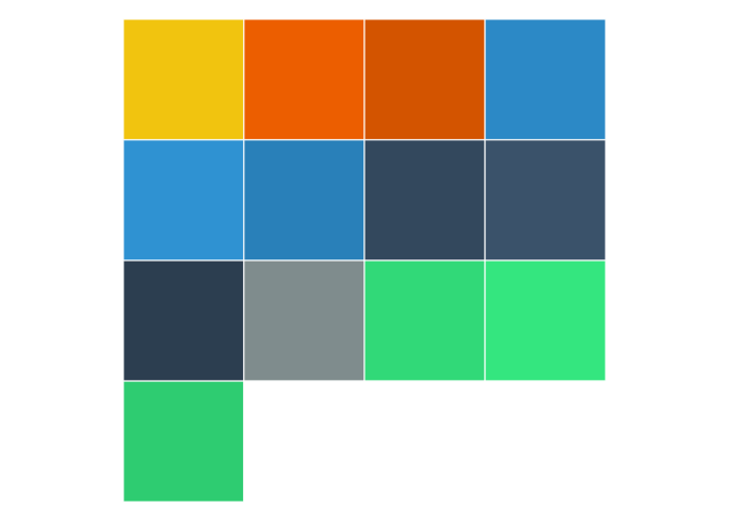
Fun part #2: We’ll use a specific color for each continent, and a brighten variation for the the separated countries. For this task the {shades} package offer the brightness function.
| Africa |
Africa |
36659 |
TRUE |
#f1c40f |
0.00 |
#F1C40F |
africa |
| Asia |
India |
75811 |
FALSE |
#d35400 |
0.10 |
#EC5E00 |
asia |
| Asia |
Rest of Asia |
140555 |
TRUE |
#d35400 |
0.00 |
#D35400 |
asia |
| Europe |
Russia |
56198 |
FALSE |
#2980b9 |
0.05 |
#2C89C6 |
europe |
| Europe |
United Kingdom |
30761 |
FALSE |
#2980b9 |
0.10 |
#2F92D2 |
europe |
| Europe |
Rest of Europe |
199804 |
TRUE |
#2980b9 |
0.00 |
#2980B9 |
europe |
| North America |
United States |
154283 |
FALSE |
#2c3e50 |
0.05 |
#33485D |
north_america |
| North America |
Mexico |
47339 |
FALSE |
#2c3e50 |
0.10 |
#3A526A |
north_america |
| North America |
Rest of North America |
19174 |
TRUE |
#2c3e50 |
0.00 |
#2C3E50 |
north_america |
| Oceania |
Oceania |
3304 |
TRUE |
#7f8c8d |
0.00 |
#7F8C8D |
oceania |
| South America |
Brazil |
98961 |
FALSE |
#2ecc71 |
0.05 |
#31D978 |
south_america |
| South America |
Chile |
9002 |
FALSE |
#2ecc71 |
0.10 |
#34E67F |
south_america |
| South America |
Rest of South America |
83471 |
TRUE |
#2ecc71 |
0.00 |
#2ECC71 |
south_america |
Then exctract some vectors:
Before continuing let’s see the original colors and the finishes obtained with the {shades} package.
The colors and levels are ready so let’s regroup the data using this new grp variable:
Then plot the previous chart but now considering all the comments made before.
The stacked column chart
For the stacked column chart we’ll use the data which have deaths by continent (no grp). This is a simple chart so the only important part is set borderWidth, groupPadding, pointPadding to 0 to remove the space between columns.
The final chart
There are some important things to do before code the final chart:
- Create and add two yAxis using
hc_yAxis_multiples and create_axis functions. One for each type of series. The two series will share the same xAxis.
- For the column series we’ll use the
id parameter with the unique(cont) value, then in the streamgraph use the linkedTo parameter to link the series. With this the Russia, UK and Rest of Europe series from the streamgraph are link with the Europe series from the stacked column chart, so if the user click the Europa legend all those series will hide.