
Post updated on Mar 26, 2024
Introducction
When you create a dashboard to track some information is usual put the important numbers big and clear at the beginning of the main section. For this, {shinydashboard} (https://rstudio.github.io/shinydashboard/) and other dashboard oriented packages for shiny like {bs4dash}, {argonDash}, {tablerDash} - all from https://rinterface.com/ - have an implementation to put this type of information know as a card or value box.
In some projects like https://jbkunst.shinyapps.io/trd-sttstcs/ I’ve implemented a modification of the original shinydashboard::valueBox to complement the information (the BIG number) with a sparkline. Always that implementation lives as a function in R/helpers.R script, so this will be a good opportunity to share the code, thoughts and ideas.
The basic valueBox
Let’s start with what we know: The most direct and simple implementation of a valueBox in {shinydashboard}.
Code
library(shiny)
library(shinydashboard)

vb <-  valueBox(
  value = "1,345",
  subtitle = "Lines of code written",
  icon = icon("code"),
  width = 4,
  color = "red",
  href = NULL)

ui <- dashboardPage(
  dashboardHeader(),
  dashboardSidebar(disable = TRUE),
  dashboardBody(
    fluidRow(
      valueBoxOutput("vbox")
    )
  )
)

server <- function(input, output) {

  output$vbox <- renderValueBox(vb)

}

# shiny::shinyApp(ui, server, options = list(launch.browser = .rs.invokeShinyPaneViewer))
This app looks like:
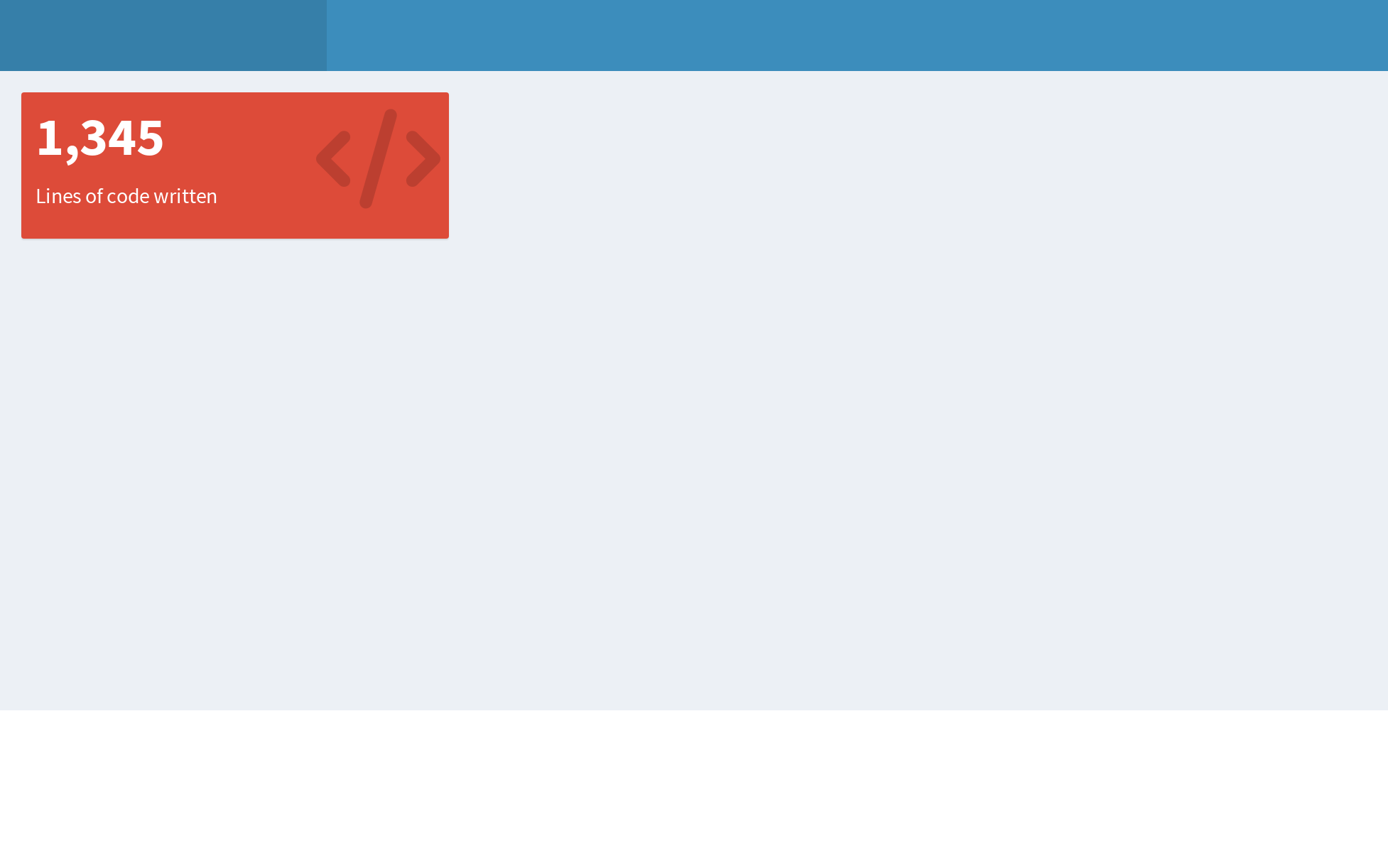
So here it is, a simple value box to emphasize information which can have an icon/color to give some meaning to the number.
Modifying the valueBox
Before to modify a value box we need to know what a valueBox is, or how is it built, so take a look what is inside this funcion.
Code
valueBox

function(value, subtitle, icon = NULL, color = "aqua", width = 4, href = NULL){

  validateColor(color)

  if (!is.null(icon))
    tagAssert(icon, type = "i")

  boxContent <- div(
    class = paste0("small-box bg-", color),
    div(
      class = "inner",
      h3(value),
      p(subtitle)
      ),
    if (!is.null(icon)) div(class = "icon-large", icon)
    )

  if (!is.null(href))
    boxContent <- a(href = href, boxContent)

  div(
    class = if (!is.null(width)) paste0("col-sm-", width),
    boxContent
    )
}
As we see, the value and subtitle arguments are the main ones. The other are just for styling and format. These elements are in div(class = "inner", ...) so here we’ll put the new content.
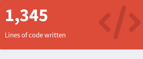
Let’s try to put a title in the top of the div and then use the subtitle as an detailed text.
Code
valueBox2 <- function(value, title, subtitle, icon = NULL, color = "aqua", width = 4, href = NULL){

  shinydashboard:::validateColor(color)

  if (!is.null(icon))
    shinydashboard:::tagAssert(icon, type = "i")

  boxContent <- div(
    class = paste0("small-box bg-", color),
    div(
      class = "inner",
      tags$small(title),
      h3(value),
      p(subtitle)
      ),
    if (!is.null(icon)) div(class = "icon-large", icon)
    )

  if (!is.null(href))
    boxContent <- a(href = href, boxContent)

  div(
    class = if (!is.null(width)) paste0("col-sm-", width),
    boxContent
    )
}
So the implementation is the same as the original valueBox function:
Code
vb <- valueBox2(
value = "1,345",
title = toupper("Lines of code"),
subtitle = tagList(HTML("↑"), "25% Since last day"),
icon = icon("code"),
width = 4,
color = "red",
href = NULL
)
The idea of put a title is to help the reader, but we use a small text to be subtle, usually I like to use a Small Caps font but in this case I used uppercase for simplicity.
Adding sparklines
The idea to add a sparkline to the value box is give more information. For example, if your have a historical data, it would be good put a sparkline to show the previous behaviour about the data, so you can compare the BIG number with the past.
Let’s simulate data to create a sparkline:
Code
set.seed(123)

N <- 20

x <- cumsum(rnorm(N)) + 0.5 * cumsum(runif(N))
x <- round(200*x)

df <- data.frame(
  x = sort(as.Date(Sys.time() - lubridate::days(1:N))),
  y = abs(x)
)

df
x y
1 2024-03-06 98
2 2024-03-07 102
3 2024-03-08 251
4 2024-03-09 302
5 2024-03-10 343
6 2024-03-11 700
7 2024-03-12 815
8 2024-03-13 609
9 2024-03-14 498
10 2024-03-15 495
11 2024-03-16 744
12 2024-03-17 860
13 2024-03-18 1020
14 2024-03-19 1055
15 2024-03-20 1000
16 2024-03-21 1378
17 2024-03-22 1490
18 2024-03-23 1172
19 2024-03-24 1402
20 2024-03-25 1345Let’s create a sparkline with {highcharter} package:
Code
library(highcharter)

hc <- hchart(df, "line", hcaes(x, y), name = "lines of code")  %>%
  hc_size(height = 100)

hc
We have our first sparkline. It’s important note the hc object will use the available horizontal (width) space, but we need to control the heigth.
Now we can create a new valueBox function;
Code
valueBox3 <- function(value, title, sparkobj = NULL, subtitle, icon = NULL,
color = "aqua", width = 4, href = NULL){
shinydashboard:::validateColor(color)
if (!is.null(icon))
shinydashboard:::tagAssert(icon, type = "i")
boxContent <- div(
class = paste0("small-box bg-", color),
div(
class = "inner",
tags$small(title),
h3(value),
if (!is.null(sparkobj)) sparkobj,
p(subtitle)
),
if (!is.null(icon)) div(class = "icon-large", icon, style = "z-index; 0")
)
if (!is.null(href))
boxContent <- a(href = href, boxContent)
div(
class = if (!is.null(width)) paste0("col-sm-", width),
boxContent
)
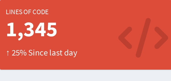
}So now:
Code
vb <- valueBox3(
value = "1,345",
title = toupper("Lines of code"),
sparkobj = hc,
subtitle = tagList(HTML("↑"), "25% Since last day"),
icon = icon("code"),
width = 4,
color = "red",
href = NULL)And the result is:
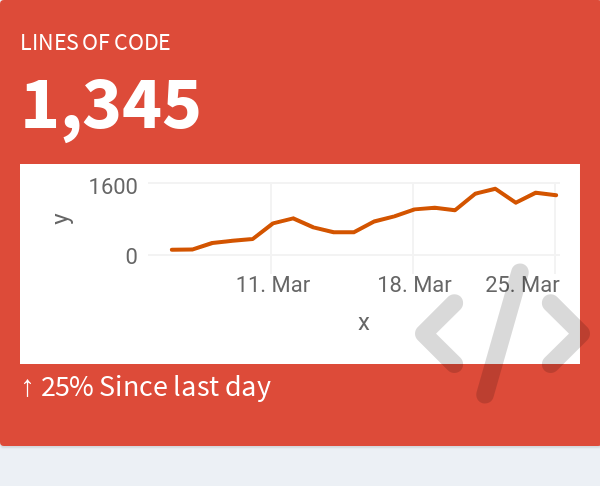
LOL! We need modify the look of the chart. For this we’ll create a custom theme. The general idea is gain space via removing axis and borders. Then have cleaner look removing grid lines… You know, show just the line.
Code
hc_theme_sparkline_vb <- function(...) {

  theme <- list(
    chart = list(
      backgroundColor = NULL,
      margins = c(0, 0, 0, 0),
      spacingTop = 0,
      spacingRight = 0,
      spacingBottom = 0,
      spacingLeft = 0,
      plotBorderWidth = 0,
      borderWidth = 0,
      style = list(overflow = "visible")
    ),
    xAxis = list(
      visible = FALSE,
      endOnTick = FALSE,
      startOnTick = FALSE
    ),
    yAxis = list(
      visible = FALSE,
      endOnTick = FALSE,
      startOnTick = FALSE
    ),
    tooltip = list(
      outside = FALSE,
      shadow = FALSE,
      borderColor = "transparent",
      botderWidth = 0,
      backgroundColor = "transparent",
      style = list(textOutline = "5px white")
    ),
    plotOptions = list(
      series = list(
        marker = list(enabled = FALSE),
        lineWidth = 2,
        shadow = FALSE,
        fillOpacity = 0.25,
        color = "#FFFFFFBF",
        fillColor = list(
          linearGradient = list(x1 = 0, y1 = 1, x2 = 0, y2 = 0),
          stops = list(
            list(0.00, "#FFFFFF00"),
            list(0.50, "#FFFFFF7F"),
            list(1.00, "#FFFFFFFF")
          )
        )
      )
    ),
    credits = list(
      enabled = FALSE,
      text = ""
      )
    )

  theme <- structure(theme, class = "hc_theme")

  if (length(list(...)) > 0) {
    theme <- hc_theme_merge(
      theme,
      hc_theme(...)
    )
  }

  theme
}
Testing the theme.
Code
hc <- hc %>%
  hc_add_theme(hc_theme_sparkline_vb()) %>%
  hc_credits(enabled = FALSE)

hc %>%
  # emulate the background color of the valueBox
  hc_chart(backgroundColor = "#DD4B39")
And trying again:
Code
vb <- valueBox3(
value = "1,345",
title = toupper("Lines of code"),
sparkobj = hc,
subtitle = tagList(HTML("↑"), "25% Since last day"),
icon = icon("code"),
width = 4,
color = "red",
href = NULL)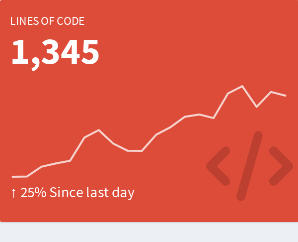
Including an information helper
Sometimes I like to add helper information icon to explain how to read the metric/number if is needed.
This can be done using the icon "info-cirle" and using the class "pull-right" to put in the corner.
Code
valueBox4 <- function(value, title, sparkobj = NULL, subtitle, info = NULL,
                      icon = NULL, color = "aqua", width = 4, href = NULL){

  shinydashboard:::validateColor(color)

  if (!is.null(icon))
    shinydashboard:::tagAssert(icon, type = "i")

  info_icon <- tags$small(
    tags$i(
      class = "fa fa-info-circle fa-lg",
      title = info,
      `data-toggle` = "tooltip",
      style = "color: rgba(255, 255, 255, 0.75);"
      ),
    class = "pull-right"
    )

  boxContent <- div(
    class = paste0("small-box bg-", color),
    div(
      class = "inner",
      tags$small(title),
      if (!is.null(sparkobj)) info_icon,
      h3(value),
      if (!is.null(sparkobj)) sparkobj,
      p(subtitle)
      ),
    if (!is.null(icon)) div(class = "icon-large", icon, style = "z-index; 0")
    )

  if (!is.null(href))
    boxContent <- a(href = href, boxContent)

  div(
    class = if (!is.null(width)) paste0("col-sm-", width),
    boxContent
    )
}
So now:
Code
vb <- valueBox4(
value = "1,345",
title = toupper("Lines of code"),
sparkobj = hc,
subtitle = tagList(HTML("↑"), "25% Since last day"),
info = "This is the lines of code I've written in the past 20 days! That's a lot, right?",
icon = icon("code"),
width = 4,
color = "red",
href = NULL
)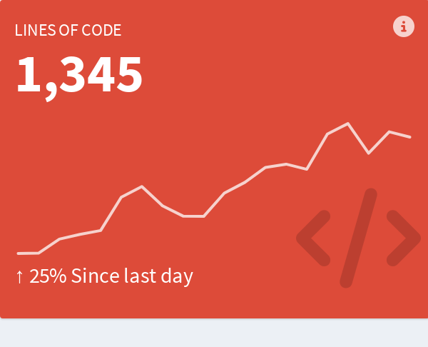
Voilà we have a value box with a information helper.
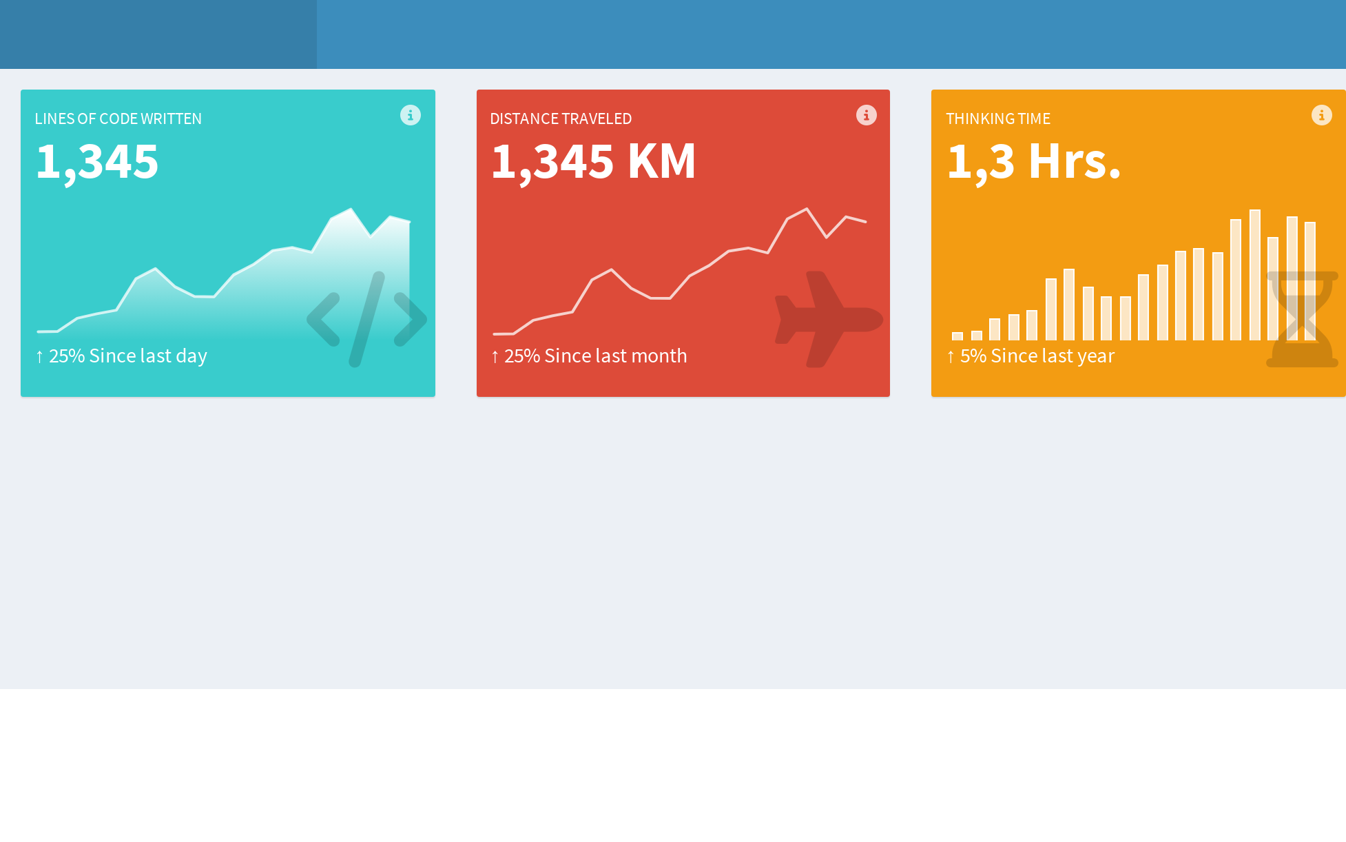
Demo
Demo section! We can use other types of charts, texts and colors:
Before the demo, let’s give a proper name to our function:
Code
valueBoxSpark <- function(value, title, sparkobj = NULL, subtitle, info = NULL,
                          icon = NULL, color = "aqua", width = 4, href = NULL){

  shinydashboard:::validateColor(color)

  if (!is.null(icon))
    shinydashboard:::tagAssert(icon, type = "i")

  info_icon <- tags$small(
    tags$i(
      class = "fa fa-info-circle fa-lg",
      title = info,
      `data-toggle` = "tooltip",
      style = "color: rgba(255, 255, 255, 0.75);"
      ),
    # bs3 pull-right
    # bs4 float-right
    class = "pull-right float-right"
    )

  boxContent <- div(
    class = paste0("small-box bg-", color),
    div(
      class = "inner",
      tags$small(title),
      if (!is.null(sparkobj)) info_icon,
      h3(value),
      if (!is.null(sparkobj)) sparkobj,
      p(subtitle)
      ),
    # bs3 icon-large
    # bs4 icon
    if (!is.null(icon)) div(class = "icon-large icon", icon, style = "z-index; 0")
    )

  if (!is.null(href))
    boxContent <- a(href = href, boxContent)

  div(
    class = if (!is.null(width)) paste0("col-sm-", width),
    boxContent
    )
}
Some charts:
Code
hc <- hchart(df, "area", hcaes(x, y), name = "lines of code")  %>%
  hc_size(height = 100) %>%
  hc_credits(enabled = FALSE) %>%
  hc_add_theme(hc_theme_sparkline_vb())

hc2 <- hchart(df, "line", hcaes(x, y), name = "Distance")  %>%
  hc_size(height = 100) %>%
  hc_credits(enabled = FALSE) %>%
  hc_add_theme(hc_theme_sparkline_vb())

hc3 <- hchart(df, "column", hcaes(x, y), name = "Daily amount")  %>%
  hc_size(height = 100) %>%
  hc_credits(enabled = FALSE) %>%
  hc_add_theme(hc_theme_sparkline_vb())
Some value boxes:
Code
vb <- valueBoxSpark(
value = "1,345",
title = toupper("Lines of code written"),
sparkobj = hc,
subtitle = tagList(HTML("↑"), "25% Since last day"),
info = "This is the lines of code I've written in the past 20 days! That's a lot, right?",
icon = icon("code"),
width = 4,
color = "teal",
href = NULL
)
vb2 <- valueBoxSpark(
value = "1,345 KM",
title = toupper("Distance Traveled"),
sparkobj = hc2,
subtitle = tagList(HTML("↑"), "25% Since last month"),
info = "This is the lines of code I've written in the past 20 days! That's a lot, right?",
icon = icon("plane"),
width = 4,
color = "red",
href = NULL
)
vb3 <- valueBoxSpark(
value = "1,3 Hrs.",
title = toupper("Thinking time"),
sparkobj = hc3,
subtitle = tagList(HTML("↑"), "5% Since last year"),
info = "This is the lines of code I've written in the past 20 days! That's a lot, right?",
icon = icon("hourglass-half"),
width = 4,
color = "yellow",
href = NULL
)Finally the app:
Code
library(shiny)
library(shinydashboard)

ui <- dashboardPage(
  dashboardHeader(),
  dashboardSidebar(disable = TRUE),
  dashboardBody(
    fluidRow(
      valueBoxOutput("vbox"),
      valueBoxOutput("vbox2"),
      valueBoxOutput("vbox3")
    )
  )
)

server <- function(input, output) {
  output$vbox <- renderValueBox(vb)
  output$vbox2 <- renderValueBox(vb2)
  output$vbox3 <- renderValueBox(vb3)
}

# shiny::shinyApp(ui, server, options = list(launch.browser = .rs.invokeShinyPaneViewer))
This app look like this :)! What do you think?
Extending the idea
Due the {bs4dash} package is based in the same template of the {shinydashboard} https://github.com/ColorlibHQ/AdminLTE is direct use the functions. There some details in the info icon, but you can remove it if you use icon = NULL.
Code
library(bs4Dash)

ui <- bs4DashPage(
  header = dashboardHeader(),
  sidebar = bs4DashSidebar(disable = TRUE),
  body = bs4DashBody(
    # this is for use tooltips in the bs4dash package
    tags$script(HTML("setInterval(function(){ $('[title]').tooltip(); }, 1000)")),
    tags$h2("Testing with {bs4dash} package"),
    tags$hr(),
    fluidRow(
      valueBoxOutput("vbox"),
      valueBoxOutput("vbox2"),
      valueBoxOutput("vbox3")
      )
    )
  )

# setTimeout(function(){ $('[title]').tooltip(); }, 3000)
# setInterval(function(){ $('[title]').tooltip(); }, 3000)
# JS("$(function () { $('[title]').tooltip() })")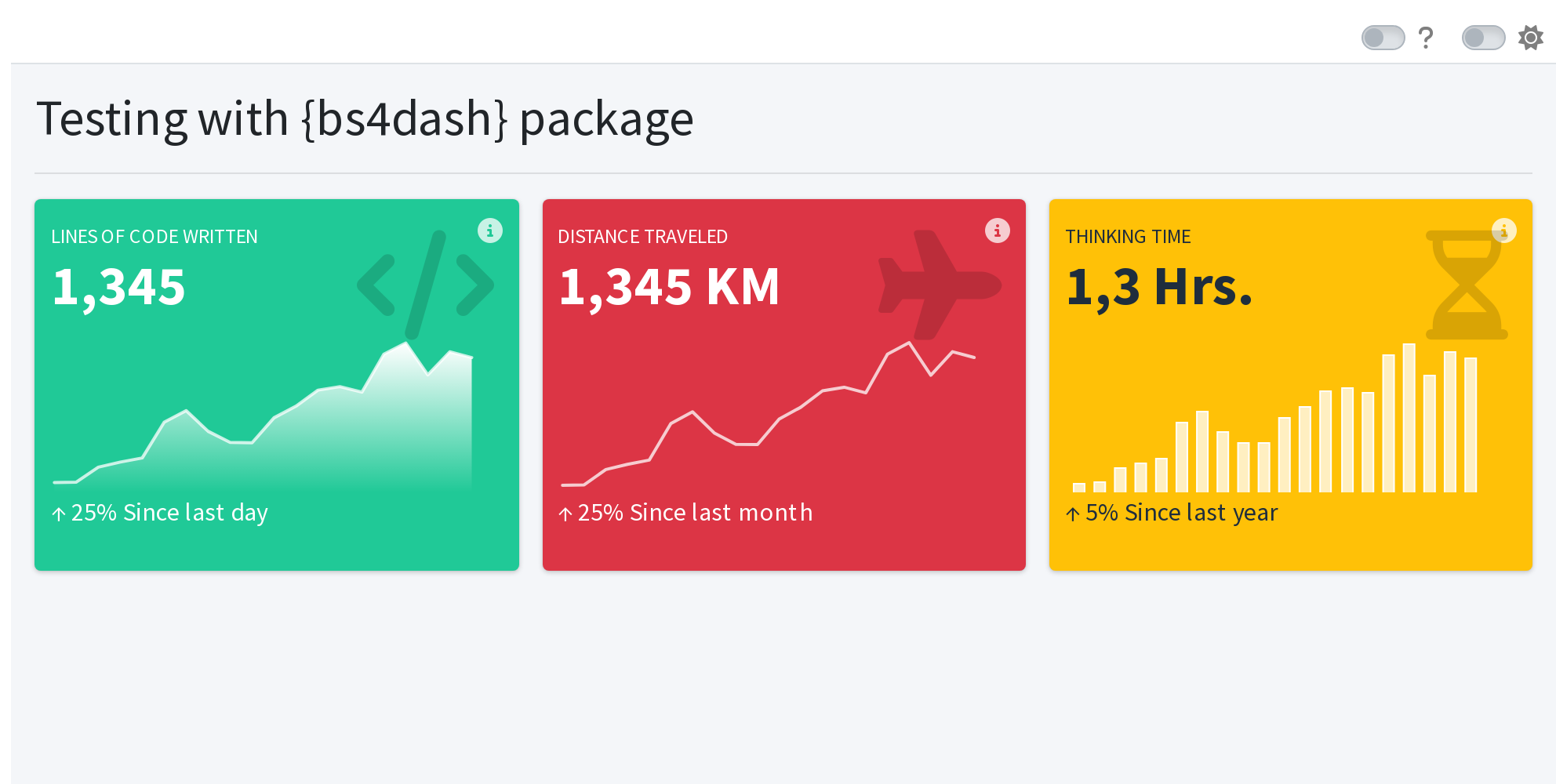
This walkthrough/tutorial will help to implement sparklines in other packages as well as other elements such as infoBox, or maybe with other htmlwidgets like {echarts4r} or {plotly}. So if you make an implementation please tell us and share with other people.
Reuse
Citation
BibTeX citation:
@online{kunst_fuentes2020,
  author = {Kunst Fuentes, Joshua},
  title = {valueBoxes and {Sparklines}},
  date = {2020-06-29},
  url = {https://jkunst.com/blog/posts/2020-06-26-valuebox-and-sparklines/},
  langid = {en}
}
For attribution, please cite this work as:
Kunst Fuentes, Joshua. 2020. “valueBoxes and Sparklines.”
June 29, 2020. https://jkunst.com/blog/posts/2020-06-26-valuebox-and-sparklines/.