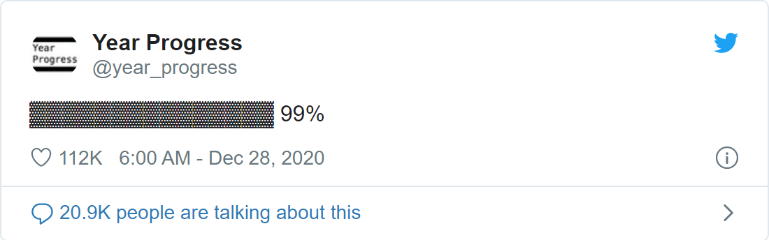
You know, is the end of the year and more than one of your contacts retweet:
Surely you remembered that in the middle of the year you saw the 50% retweet. So why not see the number of favorites throughout the year? To do this we need some packages! The main one in this post will be rtweet, because.., we need tweets.
For download tweets I followed the instructions from https://cran.r-project.org/web/packages/rtweet/vignettes/auth.html
Code
token <- create_token(
  app = "jbktests",
  consumer_key = "consumerkey",
  consumer_secret = "consumer_secret",
  access_token = "access_token",
  access_secret = "access_secret"
)
After get the tweets we filter the data and make some transformations. Then we’ll get the top tweets in terms of the favorite count to make the annotations in our chart.
Code
# in interactive mode you can avoid/remove the token argument
dtweets <- rtweet::get_timeline("year_progress", n = 400, token = token)

dtweets <- dtweets %>%
  filter(between(year(created_at), 2020, 2020)) %>%
  mutate(created_at = as.Date(created_at)) %>%
  select(created_at, text, favorite_count, retweet_count) %>%
  arrange(created_at)

dtweets <- dtweets %>%
  distinct(created_at, .keep_all = TRUE)

dtops <- dtweets %>%
  top_n(5, favorite_count)

dtops
# A tibble: 5 × 4
created_at text favorite_count retweet_count
<date> <chr> <int> <int>
1 2020-07-02 ▓▓▓▓▓▓▓▓░░░░░░░ 50% 84953 24977
2 2020-09-09 ▓▓▓▓▓▓▓▓▓▓░░░░░ 69% 168476 30591
3 2020-12-24 ▓▓▓▓▓▓▓▓▓▓▓▓▓▓▓ 98% 50075 7323
4 2020-12-28 ▓▓▓▓▓▓▓▓▓▓▓▓▓▓▓ 99% 112270 20404
5 2021-01-01 ░░░░░░░░░░░░░░░ 0% 139996 22750First chart
Ok, all according to keikau1.
Here we can see some peaks, and yes, the peaks are multiples of 5: 10, 15, 20, 75, etc. and some relevant points to, the top ones: 0, 50, 69, 98, 99.
Annotations
It would be useful to add annotations to our graph with the relevant points.
Code
df_to_annotations_labels <- function(df, xAxis = 0, yAxis = 0) {

  stopifnot(hasName(df, "x"))
  stopifnot(hasName(df, "y"))
  stopifnot(hasName(df, "text"))

  df %>%
    rowwise() %>%
    mutate(point = list(list(x = x, y = y, xAxis = 0, yAxis = 0))) %>%
    select(-x, -y) %>%
    list_parse()

}


top_annotations <- dtops %>%
  mutate(created_at = datetime_to_timestamp(created_at)) %>%
  select(x = created_at, y = favorite_count, text) %>%
  df_to_annotations_labels()
Final chart
To our final chart we’ll add some details as a better tooltip, title and the usual obvious and important stuff.
Code
hchart(data, "line", hcaes(created_at, count, group = type)) %>%
  hc_title(text = "Favorite and retweets counts from @year_progress account in 2020") %>%
  hc_tooltip(
    shared = TRUE,
    headerFormat = '{point.key}<br/>Progress: {point.text}<br/><table>',
    table = TRUE
  ) %>%
   hc_annotations(
    list(
      labelOptions = list(
        shape = "connector",
        align = "right",
        justify = FALSE,
        crop = TRUE,
        style = list(fontSize = "0.8em", textOutline = "1px white")
        ),
      labels = top_annotations
      )
    ) %>%
  hc_yAxis(title = list(text = "Count")) %>%
  # from http://jsfiddle.net/kka8eyg5/3/
  hc_xAxis(
    title = list(text = NA),
    endOnTick = FALSE,
    labels = list(
      staggerLines = 1,
      formatter = JS("function () { return Highcharts.dateFormat('%B', this.value); }"),
      tickPositioner = JS("function () {
                var positions = [],
                    tick = Math.floor(this.dataMin),
                    increment = 1000 * 3600 * 24 * 91.5; // 3 months

                for (tick; tick <= this.dataMax; tick += increment) {
                    positions.push(tick);
                }
                if (positions.indexOf(this.dataMax) == -1) positions.push(this.dataMax);
                return positions;
            }")
    )
  )
What do you think? Was the result expected?
Footnotes
“keikaku” means “plan” in Japanese↩︎
Reuse
Citation
BibTeX citation:
@online{kunstfuentes2021,
  author = {Joshua Kunst Fuentes},
  title = {Favorite and Retweets Counts from @Year\_progress Account},
  date = {2021-01-06},
  url = {https://jkunst.com/blog/posts/2021-01-06-favorite-and-retweets-counts-from-yearprogress-account},
  langid = {en}
}
For attribution, please cite this work as:
Joshua Kunst Fuentes. 2021. “Favorite and Retweets Counts from
@Year_progress Account.” January 6, 2021. https://jkunst.com/blog/posts/2021-01-06-favorite-and-retweets-counts-from-yearprogress-account.