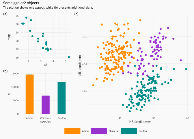
The idea is to show some packages and options that I use on a daily basis, and leave code with annotations and defaults that I normally use. We will go through the packages one by one with examples, but these can be grouped into the following categories.
- Typography: showtext.
- Annotations: ggrepel, gghighlight, ggforce, ggfittext.
- Extra features: scales and -again- ggforce.
- Tree-objects: ggparty and parttree.
Where do we start from? Define some data and some defaults plots that we would have and would like to modify.
library(tidyverse)
library(palmerpenguins)

set.seed(123)

mtcars <- mtcars |>
  rownames_to_column(var = "name") |>
  as_tibble() |>
  sample_n(20)

penguins <- penguins |>
  filter(complete.cases(penguins))

p1 <- ggplot(mtcars, aes(wt, mpg, label = name)) +
  geom_point(color = "cyan4", size = 2)
p1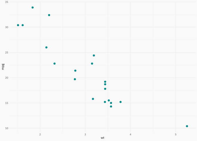
p2 <- ggplot(penguins, aes(x = bill_length_mm, y = bill_depth_mm)) +
  geom_point(aes(color = species), size = 2)
p2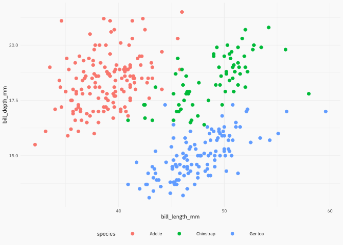
We’re ready to go!
{showtext}
Source:https://github.com/yixuan/showtext.
This package makes easy to use typography! Do you want some typography from https://fonts.google.com/? You want it? You got it!
p2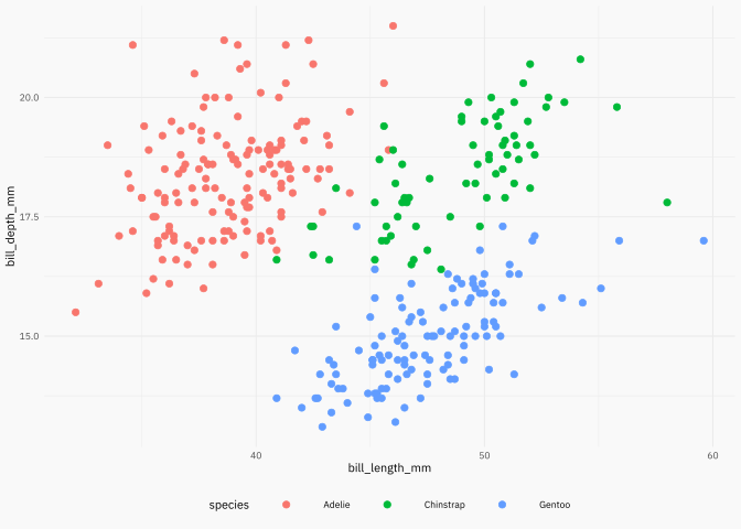
{ggrepel}
Source: https://ggrepel.slowkow.com/articles/examples.html.
This package has been on CRAN/github for a while now. Package that in combination with the data argument can make simple and effective annotations.
library(ggrepel)

p_repel1 <- p1  +
  geom_text_repel(color = "gray40", family = post_font_family)

p_repel1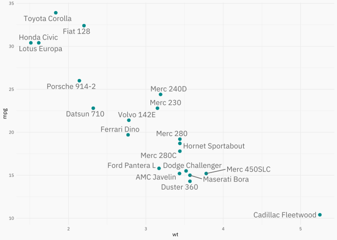
p_repel2 <- p1 +
  geom_text_repel(
    data = ~ filter(.x, mpg > 30),
    color = "gray40",
    family = post_font_family,
     force = 20
    )

p_repel2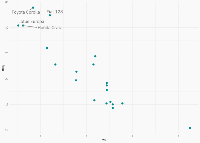
{gghighlight}
Source: https://yutannihilation.github.io/gghighlight/articles/gghighlight.html.
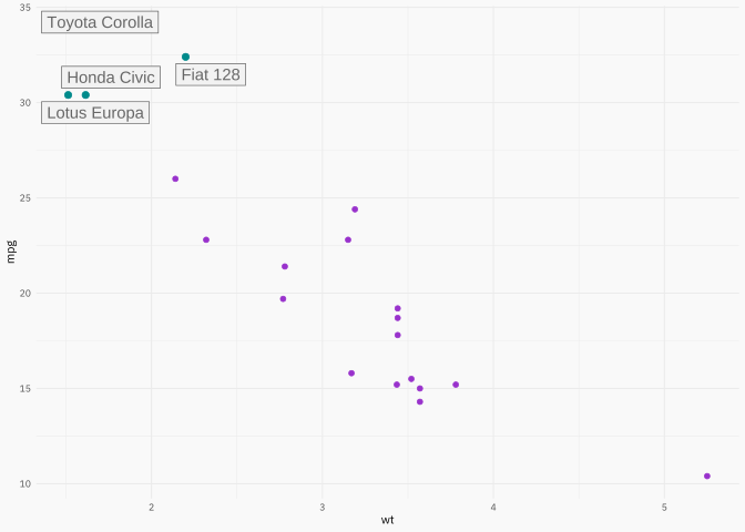
- This package is plug and play if you have to highlight data with a specific filter.
- Is important to know this package don’t work like the usual
geom_*+aes().
library(gghighlight)

p1 +
  gghighlight(
    # interest subset
    mpg > 30,
    # additional parameters
    label_key = name,
    keep_scales = TRUE,
    label_params = list(color = "gray40", label.r = 0, fill = "gray95"),
    # can change previous parameters
    unhighlighted_params = list(size = 1.5, color = "darkorchid")
    )
{ggforce}
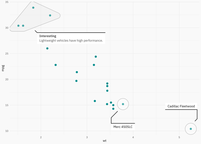
Source: https://ggforce.data-imaginist.com/.
- ggforce takes annotations to the next level.
- A lot of other functionalities like new geoms, new facets!
library(ggforce)

p1 +
  geom_mark_hull(
    aes(filter =  mpg > 30, label = "Interesting"),
    description = "Lightweight vehicles have high performance.",
    color = "gray70",
    fill = "gray90",
    concavity = 5,
    # control width text
    label.minwidth = unit(100, "mm"),
    # how much distance before show legend
    label.buffer = unit(2.5, "mm"),
    label.colour = "gray30",
    label.fontsize = 8,
    description.fontsize = 7,
    label.family = post_font_family,
    description.family = post_font_family
  ) +
  # use circle for points
  geom_mark_circle(
    aes(filter =  wt > 3.75, label = NULL, description = name),
    color = "gray70",
    fill = "transparent",
    label.fontsize = 8,
    description.fontsize = 7,
    label.family = post_font_family,
    description.family = post_font_family
   )
And other geom_mark_* like hull, circle, ellpse, rect.
p2 +
  geom_mark_ellipse(
    aes(fill = species, label = species),
    alpha = 0.1,
    color = "transparent", # a nice touch sometimes! (imho)
    label.colour = "gray30",
    label.family = post_font_family,
    description.family = post_font_family,
    label.fontsize = 8,
    description.fontsize = 7,
    # label.fontface = "plain",
    # this is just for blogpost
    expand = unit(-5, "mm"),
    radius = unit(5, "mm")
    ) +
  geom_mark_circle(
    aes(
      filter = coalesce(bill_length_mm, 0) == max(bill_length_mm, na.rm = TRUE),
      label = NULL,
      description = "A rare penguin!"
      ),
    color = "gray70",
    fill = "transparent",
    label.fontsize = 8,
    description.fontsize = 7,
    label.family = post_font_family,
    description.family = post_font_family
   ) +
  theme(legend.position = "none") +
  labs(x = NULL, y = NULL)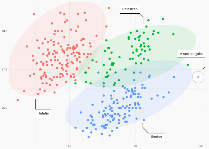
Now imagine we used a \(K\)-means algorithm:
dcenters <- penguins |>
  select(species, bill_length_mm, bill_depth_mm) |>
  filter(!is.na(bill_length_mm)) |>
  filter(!is.na(bill_depth_mm)) |>
  group_by(species) |>
  summarise(across(everything(), median)) |>
  select(-species) |>
  mutate(cluster = as.character(row_number()))

dcenters
# A tibble: 3 × 3
bill_length_mm bill_depth_mm cluster
<dbl> <dbl> <chr>
1 38.8 18.4 1
2 49.6 18.4 2
3 47.4 15 3 bnd <- penguins |>
summarise(
min(bill_length_mm, na.rm = TRUE) - 1,
max(bill_length_mm, na.rm = TRUE) + 1,
min(bill_depth_mm, na.rm = TRUE) - 1,
max(bill_depth_mm, na.rm = TRUE) + 1
) |>
as.list() |>
unlist() |>
as.vector()
p2 +
geom_voronoi_tile(
aes(fill = cluster, group = -1),
data = dcenters, alpha = 0.2, bound = bnd
) +
geom_voronoi_segment(
aes(group = -1),
data = dcenters, color = "gray90", bound = bnd
) +
xlim(bnd[1], bnd[2]) +
ylim(bnd[3], bnd[4]) +
scale_fill_viridis_d(direction = -1, option = "C") +
# its better put point over all layers
geom_point(
aes(color = species),
size = 2,
shape = 21,
color = "gray90"
) +
theme(legend.position = "right")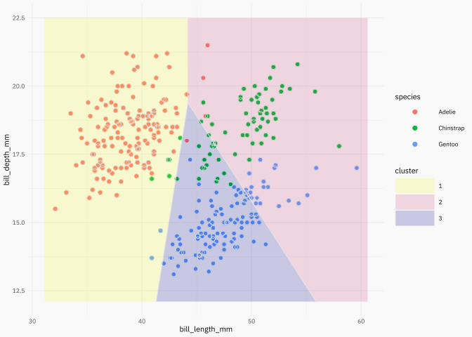
{ggfittext}
Source: https://github.com/wilkox/ggfittext.
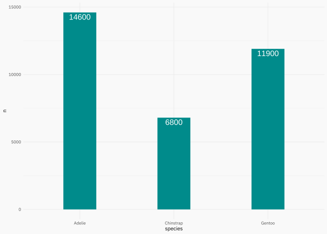
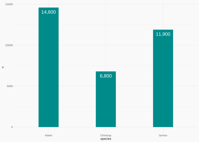
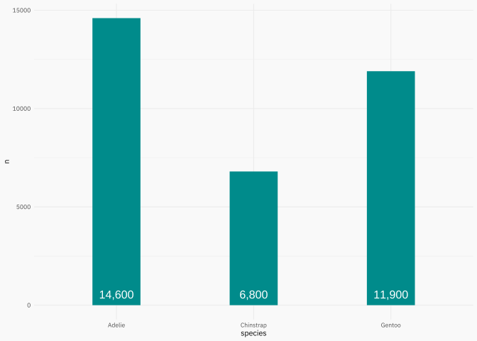
This package have a lot of features to work with strings in ggplot objects, particulary when you use treemaps.
A love the simple and useful function geom_bar_text() + geom_col() combo.
p3 +
  geom_bar_text(
    formatter = scales::comma_format(),
    padding.y =  grid::unit(2.5, "mm")
  )
p3 +
  geom_bar_text(
    formatter = scales::comma_format(),
    place = "bottom",
    padding.y =  grid::unit(2.5, "mm")
  )
{scales}
Source: https://scales.r-lib.org/.
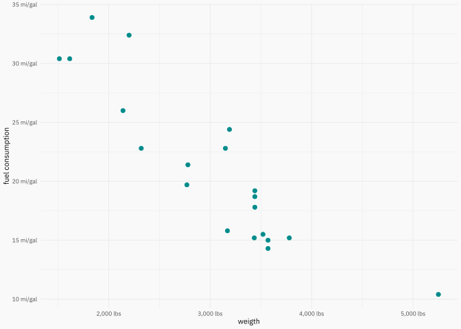
You use this package using a label_* function in the labels argument of scale_* function.
[1] "123" "456,678" "100,000" "$123" "$456,678" "$100,000"# I know the correct alternative is Mpg
miles_per_gallon <- label_comma(suffix = " mi/gal")
wt_lbl <- label_comma(scale = 1000, suffix = " lbs")
p1 +
scale_y_continuous(
labels = miles_per_gallon,
name = "fuel consumption"
) +
scale_x_continuous(
labels = wt_lbl,
name = "weigth"
)
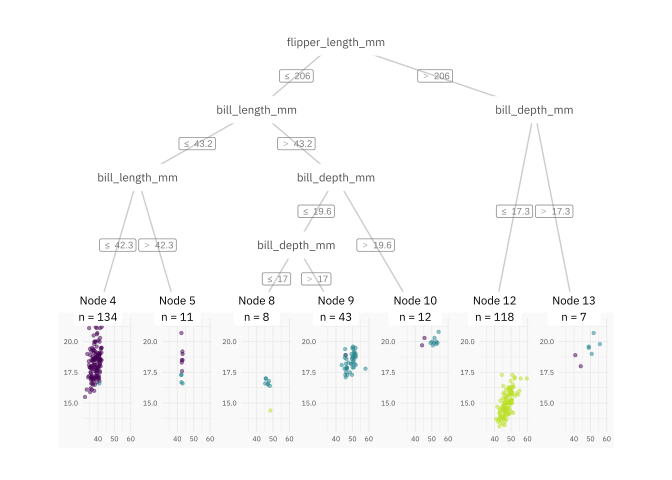
{ggparty}
Source: https://github.com/martin-borkovec/ggparty.
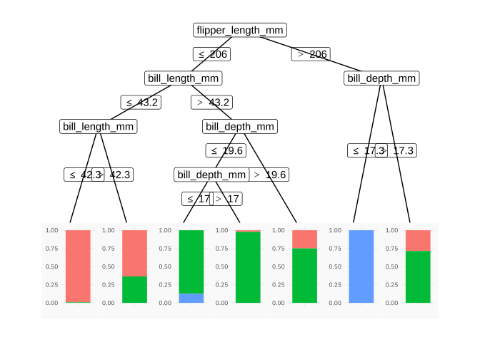
ggparty(penguinct) +
  geom_edge(color = "gray80") +
  geom_edge_label(color = "gray50", size = 2.5) +
  geom_node_label(
    aes(label = splitvar),
    color = "gray30",
    label.col = NA, # no box
    size = 3,
    family = post_font_family,
    label.padding = unit(0.5, "lines"),
    ids = "inner"
    ) +
  geom_node_plot(
    gglist = list(
      geom_point(
        aes(x = bill_length_mm, y = bill_depth_mm, color = species),
        size = 1, alpha = 0.5
        ),
      scale_color_viridis_d(end = 0.9),
      guides(color = guide_legend(override.aes = list(size = 5))),
      theme_get(),
      theme(axis.text = element_text(size = rel(0.65))),
      labs(x = NULL, y = NULL)
    ),
    scales = "fixed",
    id = "terminal"
  ) +
  geom_node_label(
    aes(label = sprintf("Node %s\nn = %s", id, nodesize)),
    ids = "terminal",
    size = 3,
    family = post_font_family,
    label.col = NA, # no box
    nudge_y = 0.01
    )
{parttree}
Source: https://github.com/grantmcdermott/parttree.
I use the {parttree} package when the model is simple, or when I want to explain the decision tree algorithm.
# remotes::install_github("grantmcdermott/parttree")

library(parttree)

# 2 independent variables
penguinct2 <- ctree(
  species ~ bill_length_mm + bill_depth_mm,
  data = penguins,
  control = ctree_control(maxdepth = 3)
  )

ggplot(penguins, aes(x = bill_length_mm, y = bill_depth_mm)) +
  geom_parttree(
    data = penguinct2,
    aes(fill = species),
    alpha = 0.2,
    color = "gray60",
    ) +
  geom_point(aes(col = species))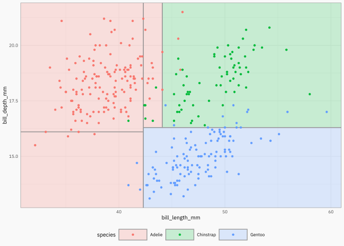
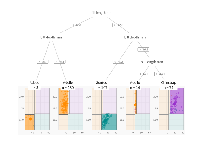
{ggparty} + {parttree}
Code
dpred_node <- penguins |>
  select(species, bill_length_mm, bill_depth_mm) |>
  mutate(
    id = predict(penguinct2, type = "node", newdata = penguins),
    species_pred = predict(penguinct2, newdata = penguins)
    ) |>
  group_by(id) |>
  summarise(
    species = unique(species_pred),
    bill_length_mm = mean(bill_length_mm),
    bill_depth_mm = mean(bill_depth_mm)
  )

dpred_node
# A tibble: 5 × 4
id species bill_length_mm bill_depth_mm
<int> <fct> <dbl> <dbl>
1 3 Adelie 37.4 15.2
2 4 Adelie 38.5 18.4
3 6 Gentoo 47.4 14.9
4 8 Adelie 43.0 18.2
5 9 Chinstrap 49.5 18.4Code
dparttree <- parttree(penguinct2)
dparttree <- dparttree |>
  as_tibble() |>
  rename(id = node) |>
  select(-path)

ggp <- ggparty(penguinct2)

ggp$data <- ggp$data |>
  as_tibble() |>
  left_join(
    dpred_node |> select(id, species),
    by = join_by(id)
    )

ggp +
  geom_edge(color = "gray80") +
  geom_edge_label(color = "gray50", size = 2.5) +
  geom_node_label(
    aes(label = str_replace_all(splitvar, "_", " ")),
    color = "gray30",
    label.col = NA, # no box
    size = 3,
    family = post_font_family,
    label.padding = unit(0.5, "lines"),
    ids = "inner"
    ) +
  geom_node_plot(
    gglist = list(
      geom_point(
        aes(x = bill_length_mm, y = bill_depth_mm, color = species),
        size = 1, alpha = 0.5
        ),
      geom_parttree(
        data = penguinct2,
        aes(fill = species),
        alpha = 0.1,
        color = "gray60",
        ),

      geom_point(
        data = dpred_node,
        aes(x = bill_length_mm, y = bill_depth_mm, color = species),
        size = 3
        ),

      geom_rect(
        data = dparttree,
        aes(xmin = xmin, xmax = xmax, ymin = ymin, ymax = ymax, fill = species),
        alpha = 0.5,
        color = "gray40",
        ),

      scale_fill_manual(values = colors),
      scale_color_manual(values = colors),
      # scale_color_viridis_d(end = 0.9),
      # scale_fill_viridis_d(end = 0.9),
      guides(color = guide_legend(override.aes = list(size=5))),
      theme_get(),
      theme(axis.text = element_text(size = rel(0.65))),
      labs(x = NULL, y = NULL)
    ),
    scales = "fixed",
    # id = "all"
    id = "terminal"
  ) +
  geom_node_label(
    aes(label = str_glue("{species}\nn = {nodesize}")),
    ids = "terminal",
    size = 3,
    family = post_font_family,
    label.col = NA, # no box
    nudge_y = 0.01
    )
{patchwork}
Source: https://patchwork.data-imaginist.com/articles/patchwork.html.
library(patchwork)

p2 <- p2 +
  scale_color_manual(values = colors) +
  theme(legend.position = "none")

p3 <- p3 +
  geom_col(aes(fill = species), width = 0.5) +
  scale_fill_manual(values = colors, name = NULL)

pp <- ((p1 / p3) | p2) +
  plot_layout(
    widths = c(1, 2),
    guides = "collect"
    ) +
  plot_annotation(
    title = "Some ggplot2 objects",
    subtitle = "The plot (a) shows one aspect, while (b) presents additional data.",
    tag_levels = "a",
    tag_prefix = "(",
    tag_suffix = ")"
    )

pp