#GOT Animating the Shifting of Affiliations

My first steps using the gganimate package using Game of Thrones

data-visualization
ggplot2
animation
Author

Joshua Kunst Fuentes

Published

April 23, 2019

Introduction

Why use GOT data? Because I was participating in #datosdemiercoles which is the spanish version of #tidytuesday. So the data is given and the purpouse is to learn new packages using that data and share with the community, you know this already, right?

Secondly the package I want to learn beside {ggforce} is {gganimate} so a very first idea was represent every character as a point and move according the actual affiliations. A kind of copy inspiration from FlowingData’s A Day in the Life of Americans1

Disclaimers

  • I know the animation is not then best way to visualiza data! Don’t judge me please! But is fun to play with.
  • I don’t follow the series so I don’t know if the results or animations makes any sense.

The data, the wrangling and the cleaning

The data come from this post where the shifting affiliations are visualized using an alluyvial diagram. It’s a nice post by Matthew Lunkes where he tell all the process to get the final chart:

In this case the data can be downloaded from this repository https://github.com/MattLunkes/GoT_Affiliations.

Code
library(tidyverse)

data <- read_csv("https://raw.githubusercontent.com/MattLunkes/GoT_Affiliations/master/got_char.csv")
data
# A tibble: 488 × 11
   Name        Origin `Starting Affiliation` `End of S1` `End of S2` `End of S3`
   <chr>       <chr>  <chr>                  <chr>       <chr>       <chr>      
 1 Tyrion Lan… House… King Robert Baratheon  King Joffr… King Joffr… King Joffr…
 2 Cersei Lan… House… King Robert Baratheon  King Joffr… King Joffr… King Joffr…
 3 Daenerys T… House… Viserys Targaryen      Daenerys T… Daenerys T… Daenerys T…
 4 Jon Snow    House… King Robert Baratheon  Night's Wa… Wildlings   Night's Wa…
 5 Sansa Stark House… King Robert Baratheon  King Joffr… King Joffr… King Joffr…
 6 Arya Stark  House… King Robert Baratheon  Other, Wes… Other, Wes… Other, Wes…
 7 Jaime Lann… House… King Robert Baratheon  King Joffr… King Joffr… King Joffr…
 8 Jorah Morm… House… Viserys Targaryen      Daenerys T… Daenerys T… Daenerys T…
 9 Theon Grey… House… King Robert Baratheon  Robb Stark… Balon Grey… King Joffr…
10 Samwell Ta… House… Night's Watch          Night's Wa… Night's Wa… Night's Wa…
# ℹ 478 more rows
# ℹ 5 more variables: `End of S4` <chr>, `End of S5` <chr>, `End of S6` <chr>,
#   `End of S7` <chr>, Episodes <dbl>

As we see, the data comes in a not tidy way so gather is our friend here.

Code
data_long <- data |>
  janitor::clean_names() |> 
  rename(end_of_s0 = starting_affiliation) |>
  select(-episodes, -origin) |> 
  gather(season, affiliation, -name) |> 
  mutate(
    season = as.numeric(str_extract(season, "\\d+")),
    affiliation = case_when(
      affiliation == "King Robert Baratheon" ~ "Baratheon",
      affiliation == "Viserys Targaryen" ~ "Targaryen",
      affiliation == "King Joffrey Baratheon" ~ "Lannister",
      affiliation == "Daenerys Targaryen" ~ "Targaryen",
      affiliation == "Night's Watch" ~ "Night's Watch",
      affiliation == "Other, Westeros" ~ "Westeros",
      affiliation == "Wildlings" ~ "Wildlings",
      affiliation == "King Tommen Baratheon" ~ "Lannister",
      affiliation == "Petyr Baelish, Lord Protector of the Vale" ~ "The Vale",
      affiliation == "Other, Essos" ~ "Essos",
      affiliation == "Roose Bolton, Lord Paramount of the North" ~ "Bolton",
      affiliation == "Queen Cersei Lannister" ~ "Lannister",
      affiliation == "Jon Snow, King in the North" ~ "Stark",
      TRUE ~ affiliation
      )
    )

# there are some repeated characters?
data_long <- data_long |> 
  semi_join(count(data, Name) |> filter(n == 1), by = c("name" = "Name")) |> 
  # importante for the ggrepel part
  arrange(season, name, affiliation)

data_long
# A tibble: 3,592 × 3
   name            season affiliation  
   <chr>            <dbl> <chr>        
 1 Addam Marbrand       0 Baratheon    
 2 Adrack Humble        0 Baratheon    
 3 Aeron Greyjoy        0 Baratheon    
 4 Aggo                 0 Khal Drogo   
 5 Alliser Thorne       0 Night's Watch
 6 Alton Lannister      0 Baratheon    
 7 Alys Karstark        0 Baratheon    
 8 Amory Lorch          0 Baratheon    
 9 Anara                0 Essos        
10 Anguy                0 Baratheon    
# ℹ 3,582 more rows

Affiliations Positions

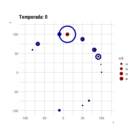
At the beginning I think use a circular layout and see what happend but the result was far for beign interesting, and as we can see I was a failure in my first attempt using {gganimate}.

Well, so the next idea and step was to get closer the affilations related. How can be two affiliations be related? An answer can be the the amount of characters which move from one to another.

Code
ts <- data_long |> 
  distinct(season) |> 
  pull() |> 
  head(-1)

change_season <- map_df(ts, function(t = 0){
  
  dout <- full_join(
    data_long |> filter(season == t),
    data_long |> filter(season == t + 1),
    by = "name", 
    suffix = c("_before", "_actual")
  ) |> 
    count(from = affiliation_before, to = affiliation_actual)
  
  dout <- dout |> 
    filter(complete.cases(dout)) |> 
    mutate(season = t)
  
  dout
  
})

change_total <- change_season |> 
  group_by(from, to) |> 
  summarise(n = sum(n)) |> 
  ungroup()

change_total
# A tibble: 119 × 3
   from                                    to                                  n
   <chr>                                   <chr>                           <int>
 1 Balon Greyjoy, King of the Iron Islands Balon Greyjoy, King of the Iro…    31
 2 Balon Greyjoy, King of the Iron Islands Deceased                            7
 3 Balon Greyjoy, King of the Iron Islands Euron Greyjoy, King of the Iro…     4
 4 Balon Greyjoy, King of the Iron Islands Lannister                           1
 5 Balon Greyjoy, King of the Iron Islands Targaryen                           3
 6 Baratheon                               Balon Greyjoy, King of the Iro…     9
 7 Baratheon                               Brotherhood Without Banners         5
 8 Baratheon                               Deceased                           15
 9 Baratheon                               Essos                               1
10 Baratheon                               House Arryn (Neutral)              12
# ℹ 109 more rows

Now, with this data we can use the {igraph} package and the graph_from_data_frame function to get a graph from the previous data frame and then get a layout.

Code
library(igraph)

g <- graph_from_data_frame(change_total, directed = FALSE)

# https://igraph.org/r/doc/strength.html
E(g)$weight <- pull(change_total, n)
V(g)$degree <- degree(g)

V(g)$label.cex <- 0.5

plot(g)

Nice! but we need the positions instead of the image. So we’ll use the layout_with_fr to get some layout of our graph.

Code
set.seed(123)
layout <- layout_with_fr(g)

affiliations <- tibble(
  affiliation = V(g)$name,
  x = layout[, 2],
  y = layout[, 1],
  degree = degree(g)
)

affiliations <- data_long |> 
  count(affiliation) |> 
  left_join(affiliations, ., by = "affiliation")

affiliations
# A tibble: 27 × 5
   affiliation                                 n       x       y degree
   <chr>                                   <int>   <dbl>   <dbl>  <dbl>
 1 Balon Greyjoy, King of the Iron Islands    46 -1.50    0.178       9
 2 Baratheon                                 200 -0.944   0.556      11
 3 Bolton                                     18 -1.14    0.573       5
 4 Brotherhood Without Banners                52 -0.0743  0.958       6
 5 Deceased                                  826 -0.691  -0.123      26
 6 Dothraki                                  100 -1.07   -1.35        6
 7 Essos                                     262 -1.06   -0.541      16
 8 Essos Slavers                             113 -0.146  -1.18        6
 9 Euron Greyjoy, King of the Iron Islands     4 -2.33    0.533       2
10 High Sparrow                                7  0.232  -0.0707      4
# ℹ 17 more rows

At this point we are ready to use ggplot and check!

Code
p1 <- ggplot(affiliations, aes(x, y, color = affiliation, label = affiliation, size = degree)) +
  geom_point() +
  geom_text() +
  scale_size(range = c(1, 4)) +
  theme(legend.position = "none") +
  labs(title = "igraph laytout")
p1

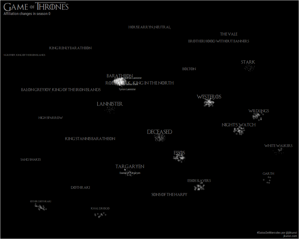
This is really an improvement from the the circular layout. The downside is the main affiliations are too close so the text is overlaping. A simple solution to this was generate an equidistant sequence for every set of coordinates, \(x\) and \(y\).

Code
affiliations <- affiliations |> 
  arrange(y) |> 
  mutate(y = seq(1:n())) |> 
  arrange(x) |> 
  mutate(x = seq(1:n())) |> 
  mutate_at(vars(x, y), ~ (.x - mean(.x))/sd(.x))

We can compare the results:

Happy with the effect of a simple fix for the overlaping text. And I think this change keep the spirit of the original graph’s shape.

Character positions

To get the character positions for every step/time/season we decided to put them in the corresponding affiliation making a circle around it and then adding a random noise

Code
get_reg_poly_coords <- function(sides = 5, radius = 1, x0 = 0, y0 = 0) {
  # https://stackoverflow.com/a/7198179/829971
  x <- radius * cos(2*pi*(1:sides)/sides) + x0
  y <- radius * sin(2*pi*(1:sides)/sides) + y0
  return(tibble(x, y))
}

characters <- data_long |> 
  count(season, affiliation) |>
  mutate(coords = map2(n, 1/nrow(affiliations), get_reg_poly_coords)) |> 
  unnest(c(coords)) |> 
  select(-season, -affiliation)

characters <- bind_cols(data_long, characters) |> 
  left_join(affiliations, by = c("affiliation"),  suffix = c(".character", ".affiliation")) |> 
  mutate(
    x = x.character +  x.affiliation,
    y = y.character +  y.affiliation
  ) |> 
  mutate_at(vars(x, y), ~ .x + runif(length(.x), -1, 1)/nrow(affiliations))
Code
p <- ggplot() +
  geom_point(aes(x, y, color = affiliation), alpha = 0.5, data = characters) +
  geom_text(aes(x, y, size = n, label = affiliation), alpha = 0.5, data = affiliations) +
  scale_size_area() +
  scale_color_viridis_d() +
  theme(legend.position = "none")
p

Nice! We are almost there.

Some details before the magic

To get a very style GOT theme we need first the font, you can download from this link https://fontmeme.com/fonts/game-of-thrones-font/.2 and use it with the {extrafont} package.

We’ll select some important characters to use with {ggrepel} package:

Code
main_characters <- data |>
  select(name = Name, Episodes) |> 
  arrange(desc(Episodes)) |>
  head(5)

knitr::kable(main_characters)
name Episodes
Tyrion Lannister 61
Cersei Lannister 58
Daenerys Targaryen 56
Jon Snow 56
Sansa Stark 54

Animation is HERE

First we need some setup for the font and colors.

Code
library(extrafont)
loadfonts(device = "win") # yeah, win! :/

font <- "Game of Thrones"
font2 <- "Roboto Condensed"
bckground <- "black"
color1 <- "#959394"
color2 <- "white"
seed <- 123

theme_set(theme_gray())

Then, the usual {ggplot2} syntax.

Code
p <- ggplot() +
  # maint characters labels
  ggrepel::geom_text_repel(
  # geom_text(
    aes(x, y, label = name),
    seed = seed,
    # box.padding = .5, force = 0.25,, max.iter = 5000,
    color = color1,
    size = 3,
    family = font2,
    vjust = "inward", hjust = "inward",
    data = semi_join(characters, main_characters, by = "name")
  ) +
  # https://stackoverflow.com/a/34398935/829971
  # maint characters points
  geom_point(
    aes(x, y),
    size = 3,
    alpha = 0.50,
    color = color2,
    stroke = 0,
    shape = 16,
    data = semi_join(characters, main_characters, by = "name")
  ) +
  # rest of points
  geom_point(
    aes(x, y),
    size = 3,
    alpha = 0.20,
    color = color2,
    stroke = 0,
    shape = 16,
    data = anti_join(characters, main_characters, by = "name") 
  ) +
  # labels affiliations
  geom_text(
    aes(x, y + 3 / nrow(affiliations), label = affiliation, size = degree),
    data = affiliations,
    color = color1,
    alpha = 0.80,
    family = font
  ) +
  scale_size(range = c(2, 5)) +
  labs(
    title = "#",
    caption = "#DatosDeMiercoles por @jbkunst\njkunst.com",
    x = NULL,
    y = NULL
  ) +
  theme(
    legend.position = "none",
    panel.border = element_blank(),
    panel.background = element_blank(),
    panel.grid = element_blank(),
    axis.text.x = element_blank(),
    axis.text.y = element_blank(),
    axis.ticks = element_blank(),
    rect = element_rect(fill = bckground, color = bckground),
    text  = element_text(family = font, colour = color1, size = 15),
    plot.title = element_text(family = font, colour = color1, size = 25),
    plot.subtitle = element_text(family = font2, colour = color1, size = 13),
    plot.caption = element_text(family = font2, colour = color1, size = 10),
  )

Finally add the {gganimate} magic:

Code
library(gganimate)

p <- p +
  labs(subtitle = "Affiliation changes in season {trunc(frame_time)}") +
  transition_time(season) +
  shadow_wake(wake_length = 0.005, alpha = TRUE, exclude_layer = 1) +
  ease_aes("exponential-in-out")

For test purposes I recommend reduce de fps to 10, and duration as much you can according how many frames you are using so you can to check if the output animation is what you want quickly, then for the final output use at least 30 fps to get a smooth transition.

Code
animate(p, fps = 30, duration = 8*3, width = 1000, height = 800)

And voilà:

Footnotes

  1. https://flowingdata.com/2015/12/15/a-day-in-the-life-of-americans/↩︎

  2. Thanks to (violetrzn)[https://twitter.com/violetrzn], https://github.com/violetr/tidytuesday/blob/master/datosdem2.R#L8↩︎

Reuse

Citation

BibTeX citation:
@online{kunstfuentes2019,
  author = {Joshua Kunst Fuentes},
  title = {\#GOT {Animating} the {Shifting} of {Affiliations}},
  date = {2019-04-23},
  url = {https://jkunst.com/blog/posts/2019-04-23-got-animating-the-shifting-of-affiliations},
  langid = {en}
}
For attribution, please cite this work as:
Joshua Kunst Fuentes. 2019. “#GOT Animating the Shifting of Affiliations.” April 23, 2019. https://jkunst.com/blog/posts/2019-04-23-got-animating-the-shifting-of-affiliations.