Data, Code and Visualization
Data, Code and Visualization
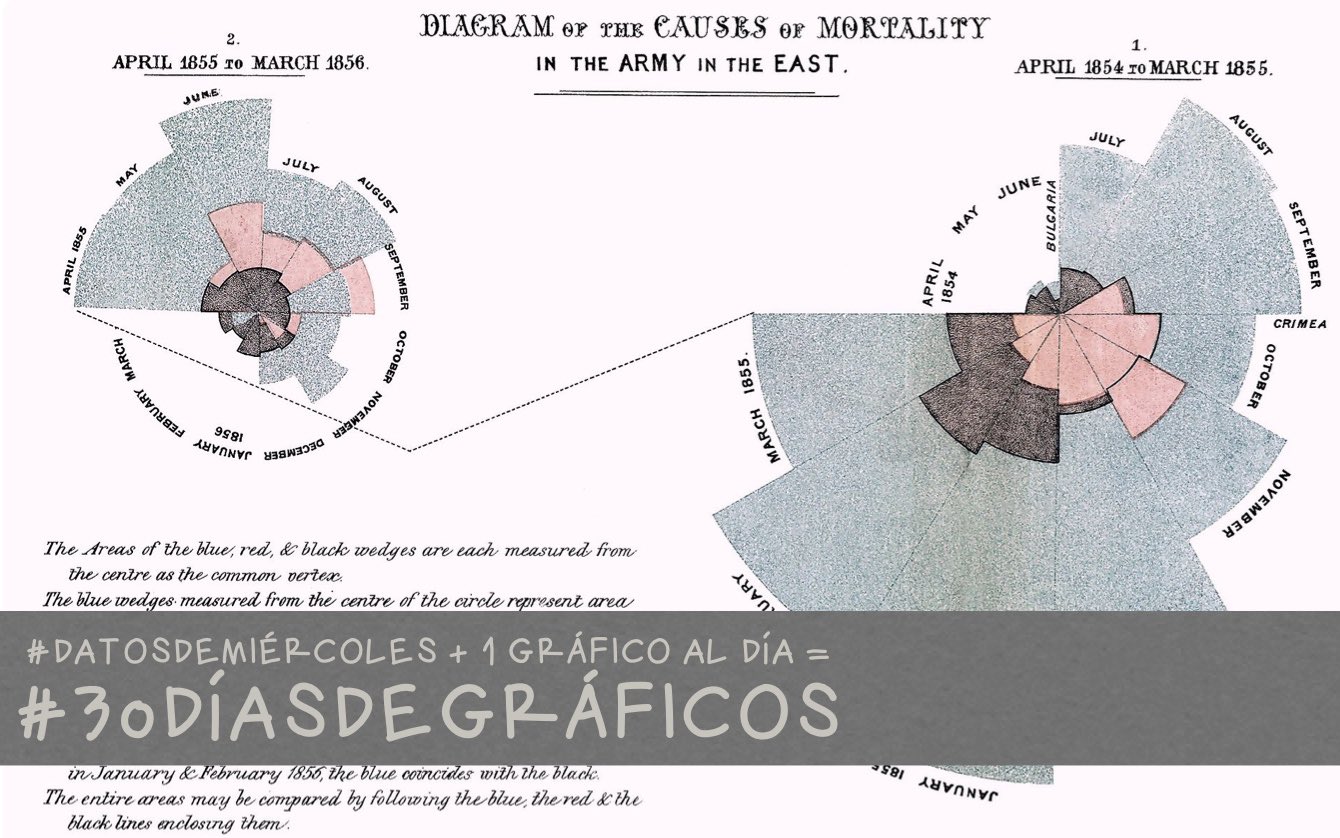
A list of sketches, ideas and notes
Categories
All
(22)
animation
(2)
chess
(2)
data-visualization
(15)
dont-forget
(3)
ggplot2
(9)
highcharter
(2)
highcharts
(14)
htmlwidgets
(2)
maps
(3)
minipost
(5)
package
(1)
shiny
(1)
spanish
(4)
stats
(2)
testing
(1)
time-series
(1)
Order By
Default
Title
Date - Oldest
Date - Newest
My favorite
ggplot2
packages with examples
11 min
minipost
ggplot2
dont-forget
Jul 23, 2023
Visualización en el Análisis de Datos
18 min
ggplot2
data-visualization
spanish
Jul 9, 2023
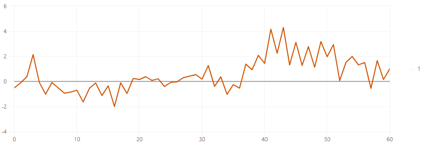
Simulating and watching autoregressive processes
11 min
minipost
stats
highcharts
highcharter
time-series
data-visualization
Jun 18, 2021
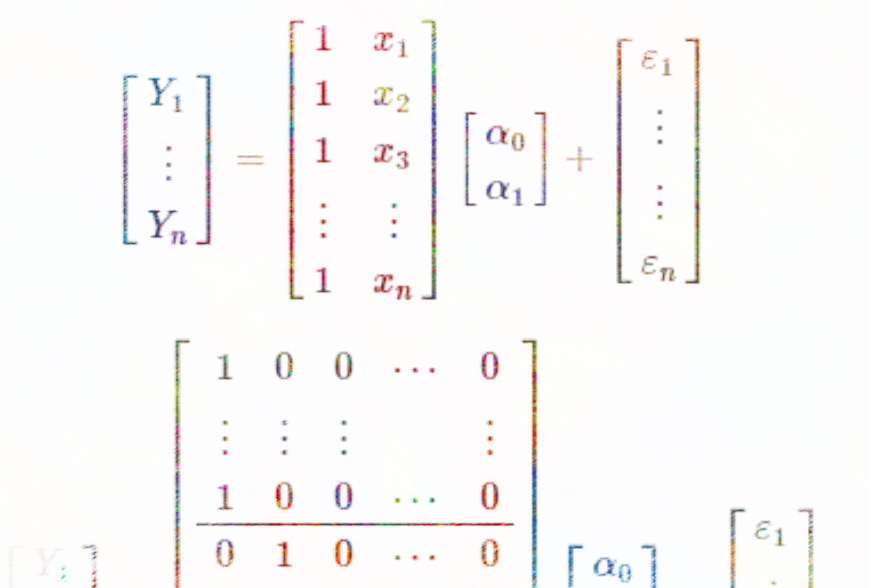
Regression, ANOVA, t-test are related…
0 min
minipost
stats
dont-forget
Jun 8, 2021
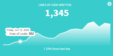
valueBoxes and Sparklines
15 min
shiny
highcharts
highcharter
htmlwidgets
Jun 29, 2020
The tale of two charts combined
9 min
data-visualization
highcharts
Jun 24, 2020
30diasdegraficos Parte 3
11 min
spanish
highcharts
data-visualization
ggplot2
Jun 2, 2020
30diasdegraficos Parte 2
26 min
spanish
highcharts
data-visualization
ggplot2
May 22, 2020
30diasdegraficos Parte 1
19 min
spanish
highcharts
data-visualization
ggplot2
May 12, 2020
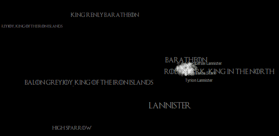
GOT Animating the Shifting of Affiliations
8 min
data-visualization
ggplot2
animation
Apr 23, 2019
When charts are integrated in the web page
2 min
data-visualization
highcharts
Apr 8, 2019
Using tooltips in unexpected ways
2 min
data-visualization
highcharts
Feb 4, 2019
Giving a Thematic Touch to your Interactive Chart
6 min
data-visualization
highcharts
Mar 3, 2017
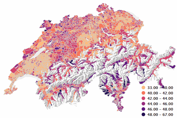
Thematic Interactive Map
3 min
maps
data-visualization
highcharts
minipost
Jan 20, 2017
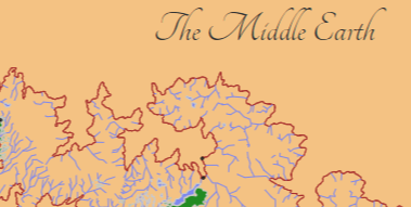
Interactive and Styled Middle Earth Map
3 min
maps
highcharts
Dec 15, 2016
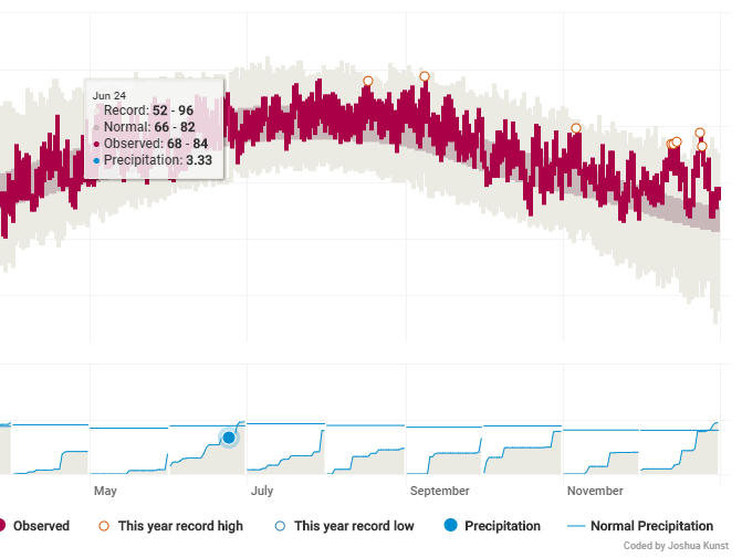
Replicating NYT Weather App
5 min
data-visualization
highcharts
Dec 2, 2016
Adding motion to choropleths
1 min
maps
highcharts
animation
Apr 12, 2016
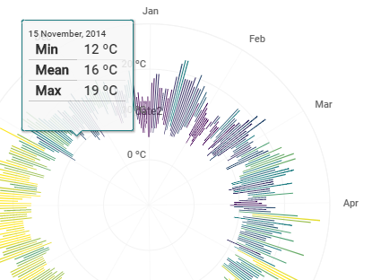
How to: Weather Radials
3 min
data-visualization
highcharts
ggplot2
minipost
Mar 24, 2016
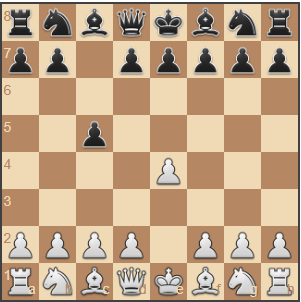
Visualizing Chess Data With ggplot
12 min
data-visualization
ggplot2
chess
Oct 30, 2015
rchess a Chess Package for R
1 min
package
htmlwidgets
chess
Oct 7, 2015
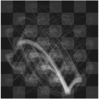
Visualizing sort algorithms with ggplot2
4 min
ggplot2
data-visualization
Sep 25, 2015
Quarto post example
1 min
testing
dont-forget
Jan 1, 2000
No matching items